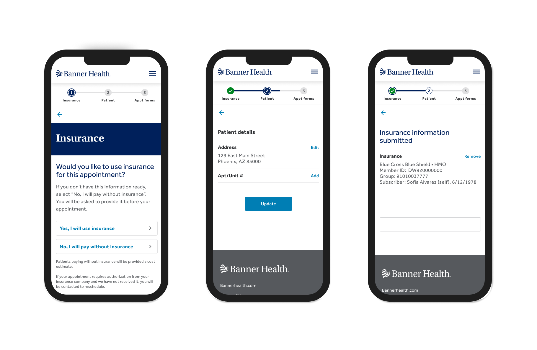
The Problem
Patients were abandoning forms they'd rather skip than finish
Patients were dropping out of pre-visit forms at alarming rates. The forms themselves weren't the issue — it was the experience of moving through them. When patients started filling out their information, they had no sense of how much work remained or how close they were to finishing. A linear guided flow gave them no momentum, no visible progress to push through the friction of multi-step entry. They'd abandon halfway through, leaving the practice without critical information before appointments.
Without visibility into their progress, patients lacked the motivation to complete what felt like an endless task.
The gap was clear: we needed to understand whether adding a progress tracker could shift that behavior — whether showing patients where they stood and how much ground was left would be enough to keep them moving forward.
Discovery & Decision
Two studies answered two different questions — and together they proved what actually changed behavior
The first study asked a narrower question: which visual treatment could patients actually read and understand at a glance? The second asked a harder one: did showing progress actually change what patients did? Testing those separately made the second study's answer trustworthy — it wasn't just that people liked seeing a tracker, it was that one specific design decision measurably shifted completion behavior.
That second study included something the first didn't: a true control, a version of the flow with no tracker at all. Against that baseline, the difference was stark. Patients using the no-tracker version were never willing to rank it as their preferred design, and several described feeling lost — one said it felt like they "could have been there for like 40 minutes." The moment any tracker appeared, that disorientation disappeared.
But the more useful finding was more specific than "trackers help." The second study tested whether showing a patient's completed steps — not just their current position — changed their behavior. It did. The design showing completed, current, and remaining steps together won decisively on preference, on perceived clarity, and most tellingly, on how confident people felt about picking the flow back up if they'd had to stop and return later.
That pattern connected directly to three behavioral principles:
- Goal gradient effect — patients described feeling more motivated as visible progress accumulated, not just as they neared the end
- Zeigarnik effect — incomplete steps stayed mentally "open," pulling patients back to finish rather than letting them drift away
- Feedback loop — seeing exactly where they stood kept patients oriented through a workflow they'd otherwise find disorienting
The challenge was convincing PMs that the engineering lift was worth it. I brought them the completion-likelihood data alongside the behavioral principles — not just "users liked it more," but why the difference in design translated directly into the outcome they cared about: completion rate.
Once they understood the mechanism, not just the preference score, they became advocates for prioritizing the component — even with the development cost factored in.
Results
Research-backed design that moved through the organization — and into the design system
The progress tracker moved the needle on what mattered most: patients actually finishing their pre-visit forms. Across both studies, patients never once chose a design without a tracker, and in the follow-up study, the design showing completed steps alongside what remained won decisively — on preference, on perceived clarity, and especially on how confident people felt about resuming after they'd stopped partway through.
That research convinced the PMs. They became advocates for prioritizing the feature, recognizing the business case wasn't just about better UX — it was about completion rates. I worked with the Design System team to add the progress tracker as a reusable component so future forms could benefit from the same pattern. The design specs included full keyboard accessibility support, ensuring the experience worked for all patients regardless of how they navigated.
The first study had already narrowed the visual pattern to a numbered-step, checkmark-based tracker — chosen for usability as much as for its lower engineering lift. The second study built on that foundation, testing three variations side by side: no tracker at all, a tracker showing only the current and remaining steps, and a tracker showing completed progress alongside what was next. Patients consistently chose the design that let them see where they'd been and where they were going.
The component is currently in development and on track for a September 2026 release — the first reusable progress tracker in the design system, available to any future form in the pre-visit workflow.
Approach
Identify the gap, run the research, make the case, ship the component
The process moved from problem identification through two research studies — each building on the previous one — to stakeholder advocacy and design system contribution. The research wasn't decorative. It was the evidence that moved the component from "nice to have" to prioritized engineering work.
The starting point wasn't a feature request — it was an observation. Patients were dropping out of pre-visit forms at rates that didn't match the form's actual complexity, with no sense of how far along they were or how much remained.
- Proactively spotted the gap — identified from watching completion patterns, not from a stakeholder request
- Framed it as a testable hypothesis: a progress tracker would change completion behavior by giving patients the context to keep going
- Scoped the open question before designing anything — which kind of progress visibility would do the most work, and why

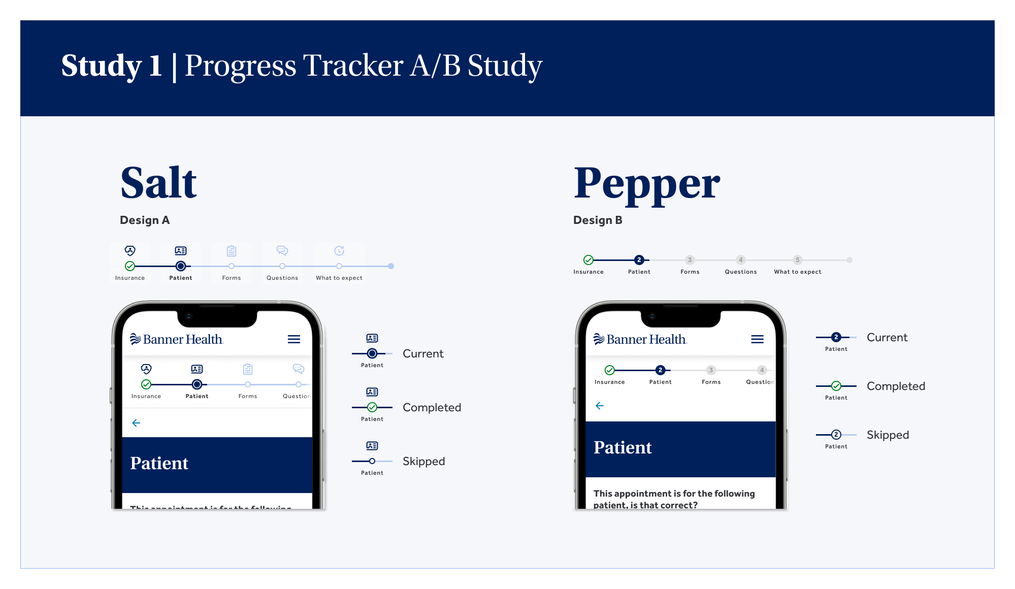
Before testing whether a progress tracker changed behavior, I needed to know which visual treatment patients could actually read and understand. Study 1 was an unmoderated A/B test — 20 participants — comparing Salt (an icon for each step, distinct visual states) against Pepper (plain numbers, subtler state styling).
- SUS scores close and not significant — Salt 83 (grade A) vs. Pepper 76 (grade B)
- Qualitative signal from think-aloud commentary: distinct state styling helped, but icons alone didn't add a measurable performance benefit over plain numbers
- Recommended combining the two — Pepper's simpler numbering paired with Salt's distinct state styling, avoiding the added cost of a full icon system
Artifacts:
Salt vs. Pepper — Study 1 Design Variants
The two visual tracker treatments compared in the unmoderated A/B study: Salt and Pepper.

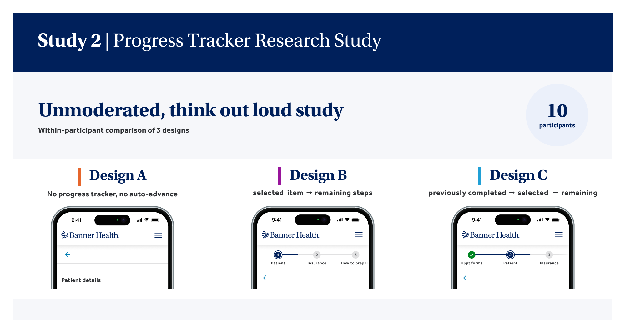
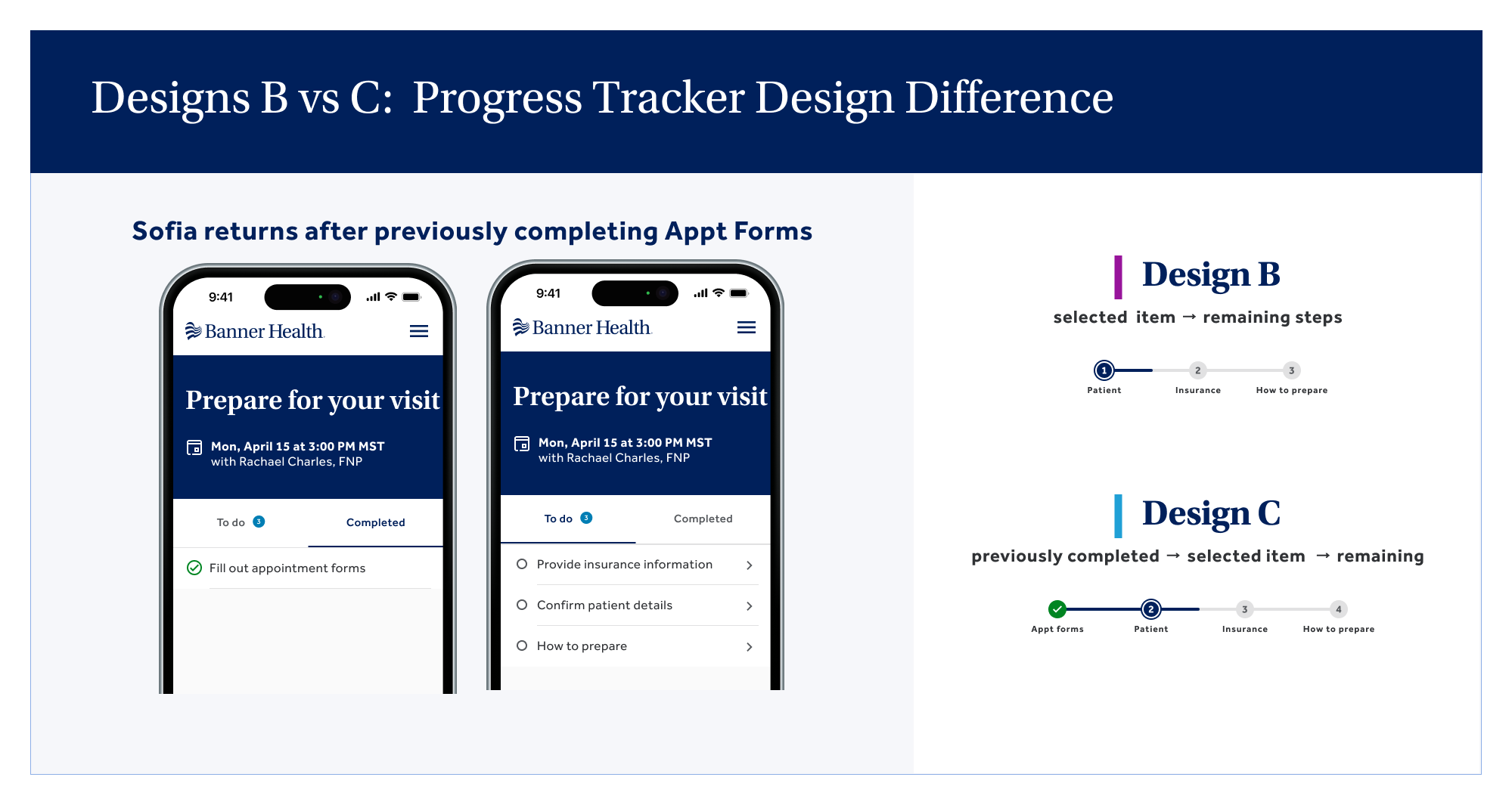
Where Study 1 tested visual clarity, Study 2 tested behavior — an unmoderated, think-aloud usability study with 10 participants, each comparing three designs including a true no-tracker control.
- Design A (no tracker) was never preferred and consistently described as disorienting — one participant said it felt like they "could have been there for like 40 minutes"
- Design C (completed + current + remaining) won decisively — 55% preference, 70% clarity, and 70% confidence resuming after a stop, vs. just 10% for Design B
- The resumability gap mattered most for the business case — it tied directly to protecting momentum on a task patients were likely to abandon and return to more than once
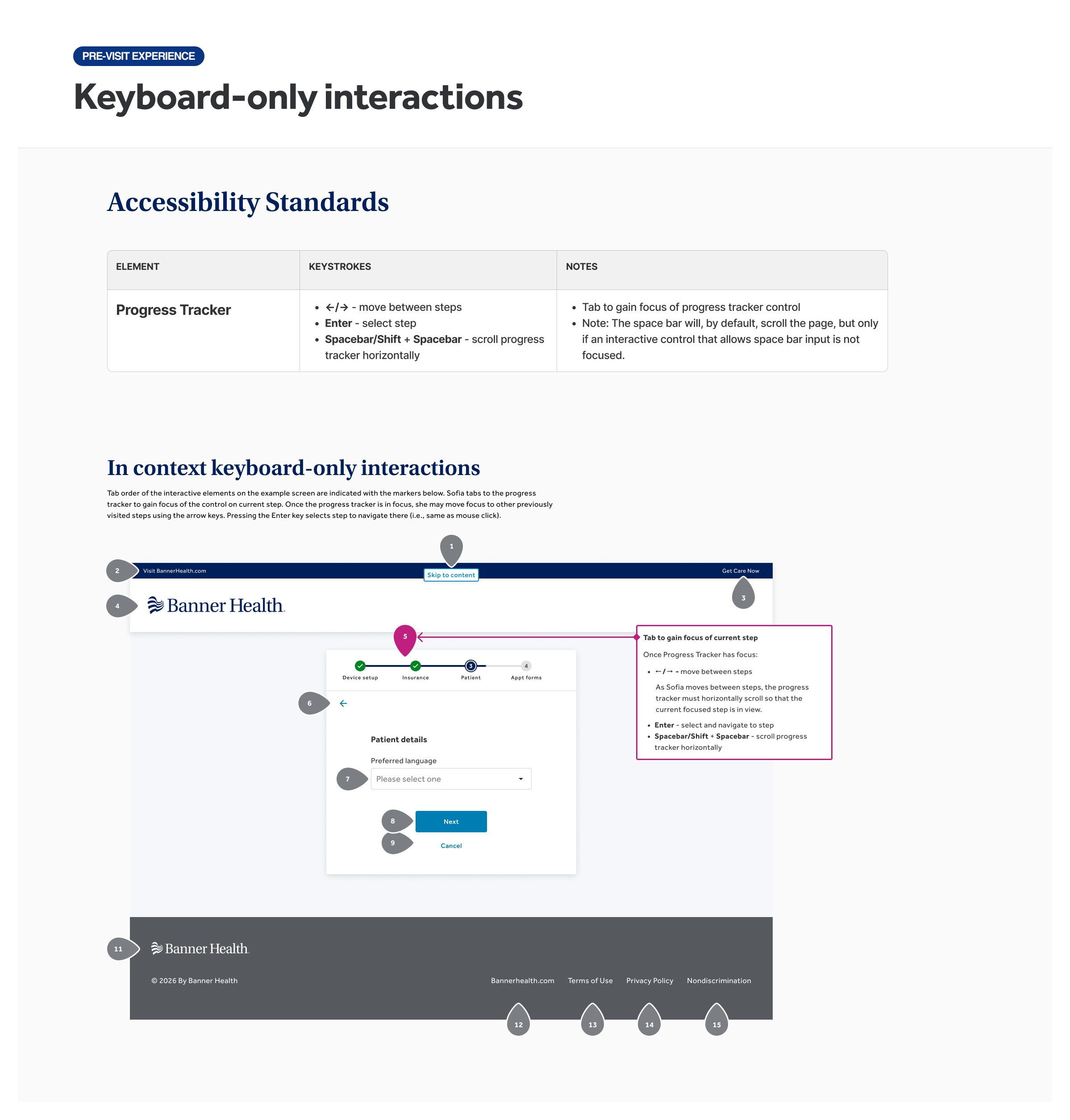
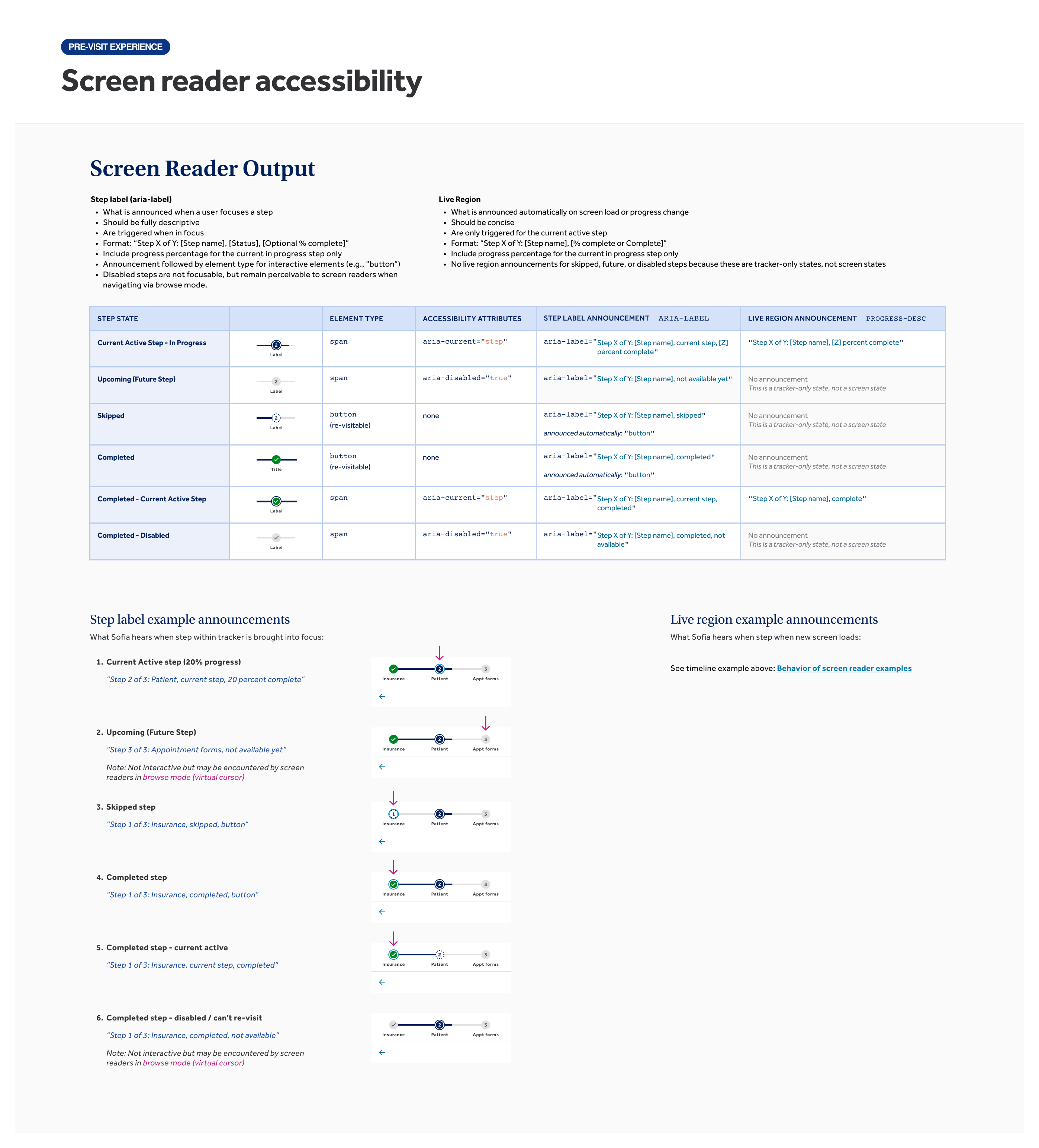
- Shaped the accessibility spec — keyboard navigation, screen reader behavior, and responsive behavior across breakpoints
Artifacts:
Study 2 — Usability Test Designs
Three variations tested: no tracker (control), current and remaining steps only, and full context — completed, current, and remaining steps together.
With Study 2's results in hand, the challenge was translating a preference score into a business case PMs would act on.
- Grounded the findings in behavioral science — Goal Gradient Effect, Zeigarnik Effect, and feedback loop — each traceable to a specific data point from Study 2
- Reframed the conversation from "do users like it?" to "here's what changes behavior, and here's the data proving it"
- Result: PMs became advocates for prioritizing the component, even with the development cost factored in
With stakeholder buy-in secured, the final phase translated the research-validated design into a reusable component spec — built for every future multi-step workflow in the pre-visit experience, not just this one form.
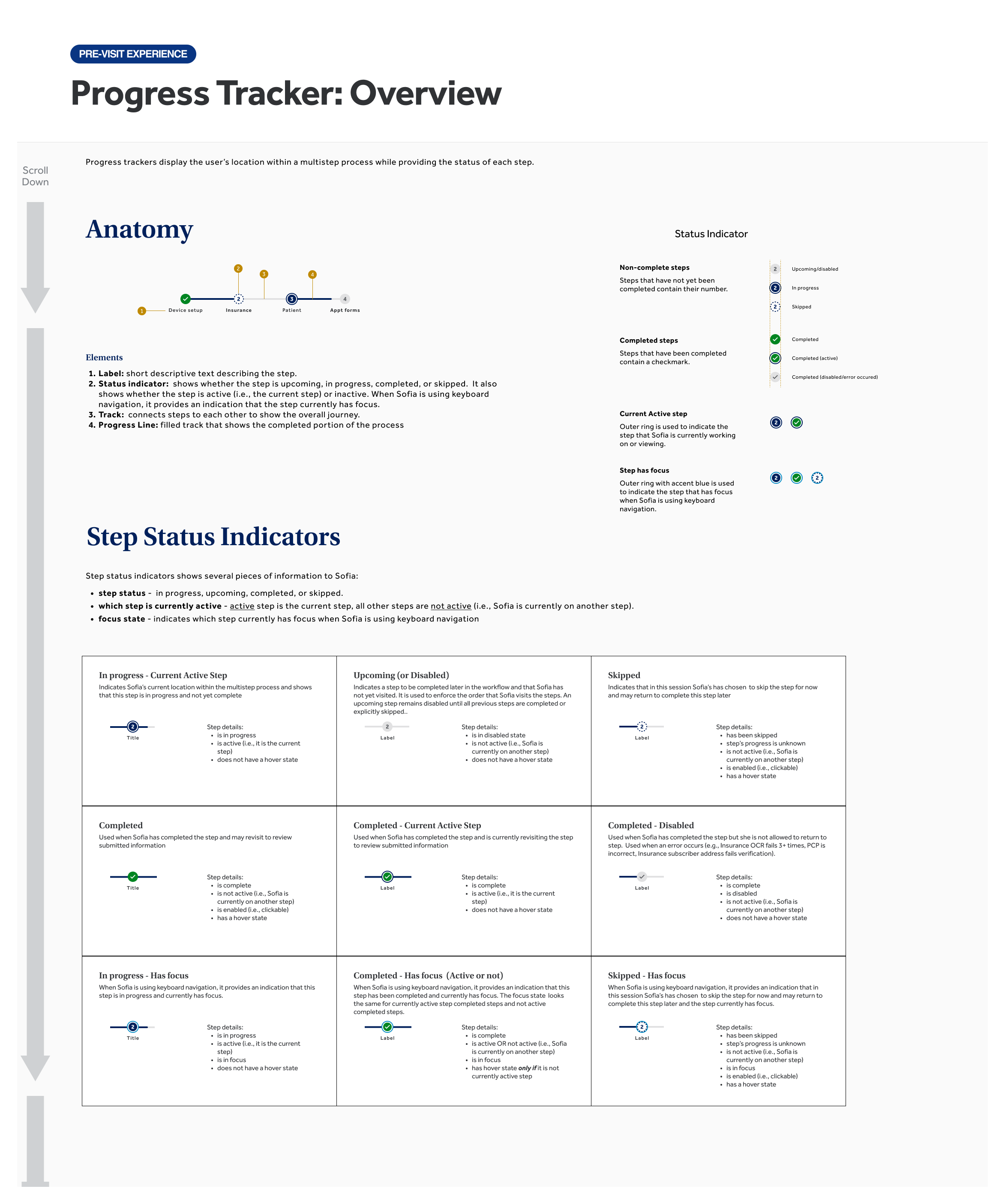
- Documented every interaction state — default, active, completed, skipped
- Specified full accessibility support — keyboard navigation and screen reader requirements, before handoff
- Every spec decision traced back to something validated in one of the two studies
Artifacts:
Progress Tracker — Final Design & Interaction States
Final design with all interaction states documented.
Accessibility Specifications
Examples from specifications for keyboard navigation and screen reader behavior.
Takeaways
Evidence over intuition
This project worked because it didn't stop at "users preferred Design C." Patients abandoning a form is a behavior problem, not a preference problem — and the only way to get an organization to fund a fix is to show the principle behind the behavior, not just the symptom.
Translating research into something an organization acts on is its own skill, distinct from running the research itself:
- Behavioral science fluency — naming the Goal Gradient Effect, Zeigarnik Effect, and Feedback Loop principles, not just observing that people preferred Design C, grounded the result in principles stakeholders could trust would hold beyond the test.
- Evidence-based advocacy — bringing PMs the behavioral principles alongside the data shifted the conversation from "do users like it?" to "this design changes behavior, and here's the proof."
- Designing for scale — contributing one validated component to the design system means every future multi-step workflow inherits the same behavioral foundation and accessibility support, not just this one form.
A progress bar looks like a small interface decision. The research — and the case built on top of it — is what turned a hypothesis into something the whole organization could trust.