The Stakes
Healthcare billing arrives at one of the hardest moments — when patients are already depleted from fighting for their health
A medical experience takes a lot out of people. Whether it's a diagnosis, a procedure, or a difficult stay, patients come through it emotionally and physically spent. Then the bills arrive.
For many patients at Banner Health, what followed was a second ordeal — not always because charges were wrong, but because the billing experience was genuinely hard to navigate. Moderated interviews with recently-billed patients made the human cost concrete:
If you don't have that bill… it's hard to get in.
— Patient interview participant
I'm not sure what I actually owe or if insurance paid.
— Patient interview participant
The amount of hours I spent was worth two days of work.
— Patient interview participant
One patient described calling to resolve a billing issue and receiving a new case ID on every call — none connected to any prior conversation. Another asked simply: "How do you know you're not going to get a third bill?" The billing journey was creating confusion, eroding trust, and stealing time and energy from people who were already running low on both.
The Problem
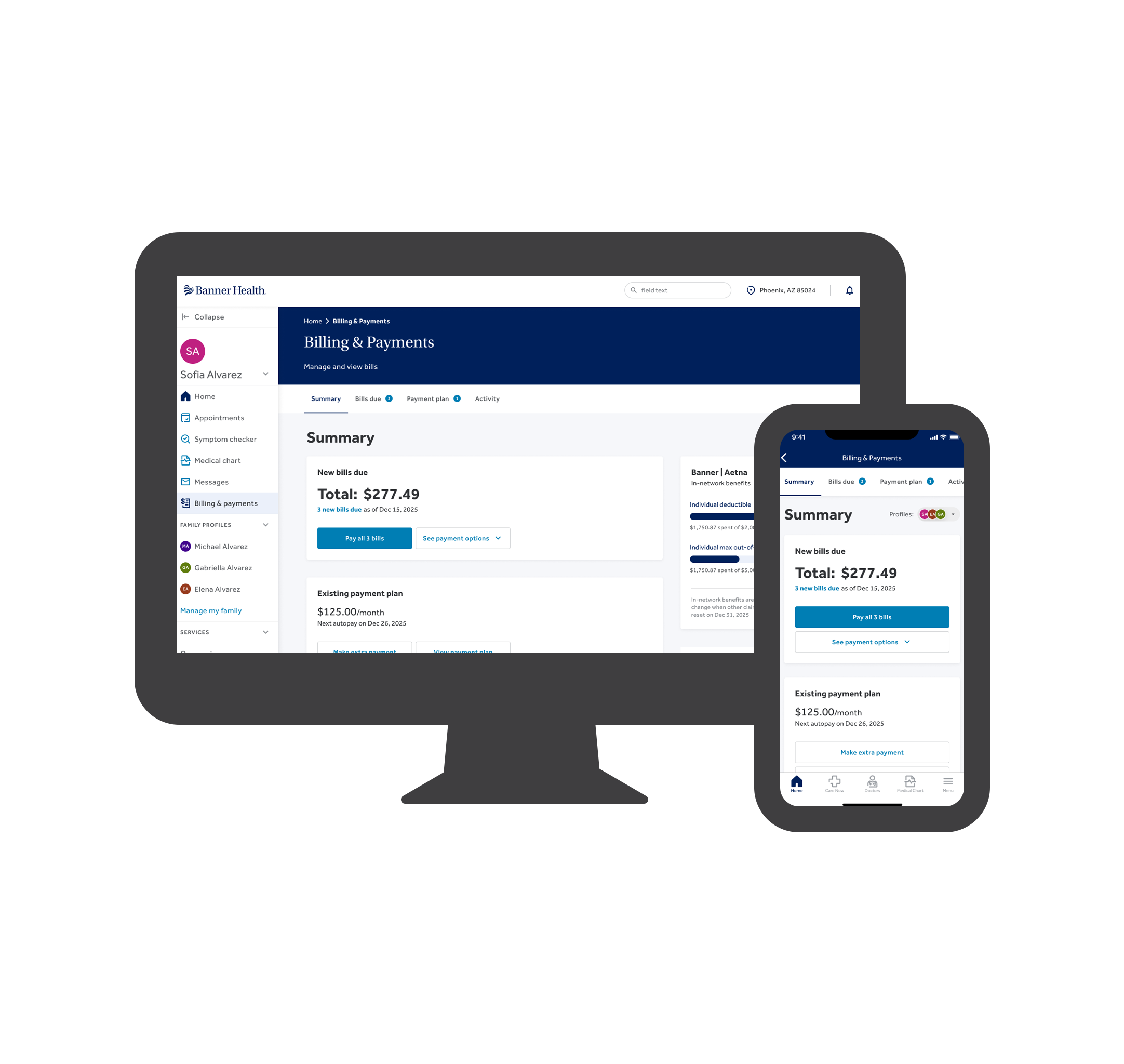
Patients can't see their billing picture because the systems behind it don't share one either
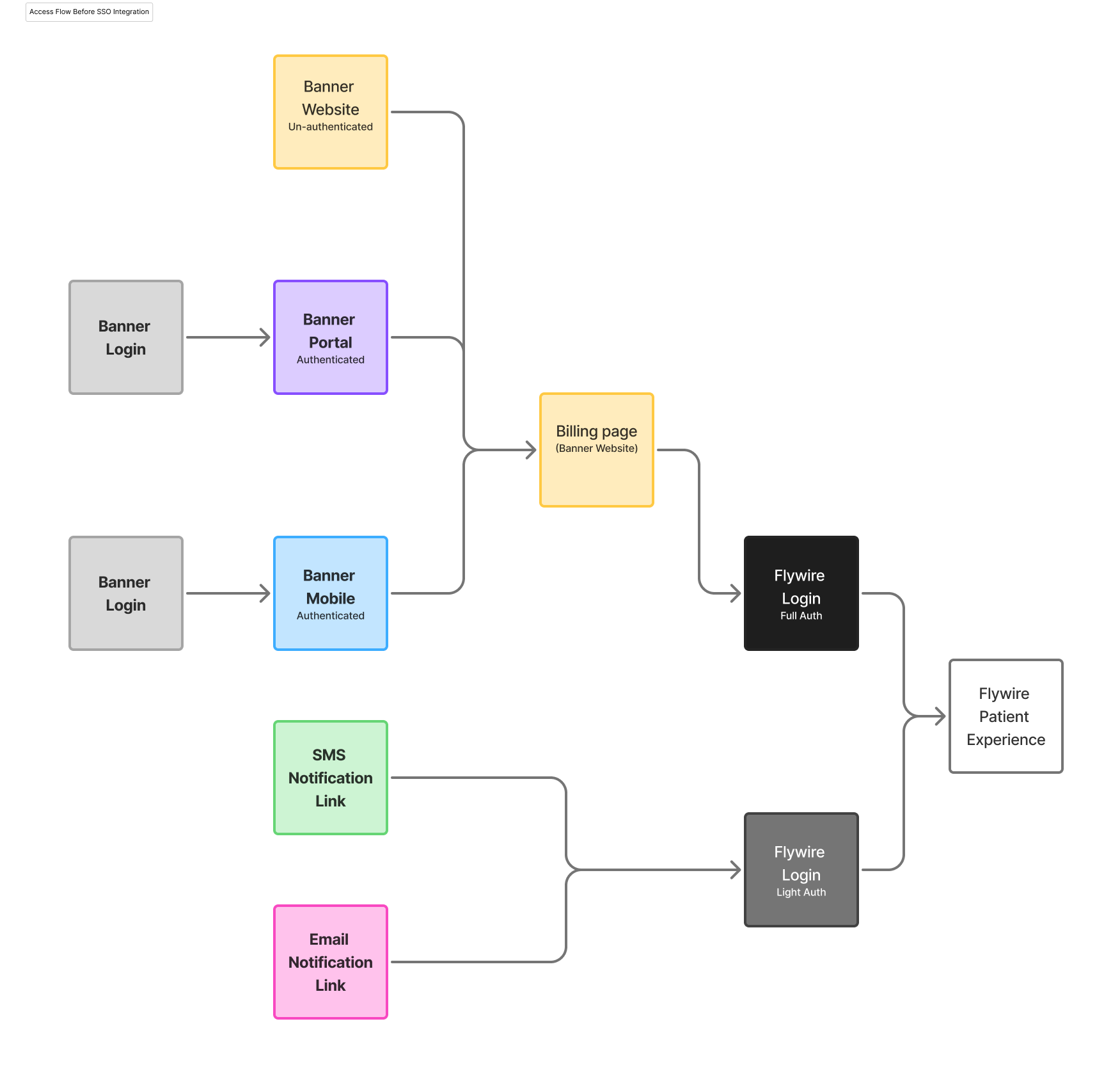
At first glance, the problem looked like an access issue: patients authenticated in the Banner portal had no path to their billing information from there. To pay a bill, they had to exit, navigate to a separate public site, and re-authenticate using an account number most didn't have on hand.
But the access problem was a symptom. The deeper issue is genuine infrastructure fragmentation — not the result of poor design decisions, but of how these systems evolved over time. Patient account information lives in different systems depending on the type of care received: urgent care, ambulatory, home services, and others each have their own. Call center notes — the records of every time a patient reached out for help — are captured in whichever of those systems matches the care type, with no shared issue IDs and no consistent field for whether a problem was actually resolved.
And those are only the patient account systems. The full billing picture spans care records, insurance payment processing, imaging and radiology, and Flywire — the third-party platform that currently serves as the only patient-facing UI for online payment. Flywire handles transactions and shows some bill information, but patients have no centralized place to see their full history, track the status of a disputed charge, or confirm a refund has been processed.
There's also a timing dimension. Data across these systems reconciles on different schedules. A patient checking their balance on a Tuesday and again the following Wednesday might see different numbers — not because anything changed, but because the systems hadn't yet caught up with each other. Building a reliable patient-facing experience on top of this infrastructure isn't simply a design problem. It requires understanding what the data actually is, when it's trustworthy, and what would need to change upstream before anything new can be shown downstream.
The Strategy
Find the highest-leverage quick win, prove it matters, then earn the room to solve the real problem
Faced with a problem this large and this entangled, the temptation is to try to fix everything at once — or to wait until the full solution is clear before doing anything at all. I chose a third path: identify the most accessible, highest-confidence improvement, ship it, and use the evidence it generates to justify the deeper investment needed for the harder work.
The access problem was well-scoped, technically feasible, and directly in our control. An SSO integration would let patients authenticated in the Banner portal or mobile app pass seamlessly into Flywire without re-authenticating. It wouldn't solve the full billing experience. But it would remove a real barrier, reach a meaningful number of patients, and give us data we didn't yet have: proof that when the friction was lower, patients would engage.
That proof mattered. It's easier to fund a complex, multi-phase service design initiative when you can point to tens of thousands of patients who found a tile we silently placed on a page — and kept coming back.
Phase 1 — The Foothold
A single tile, deliberately constrained, designed to build trust before asking for it
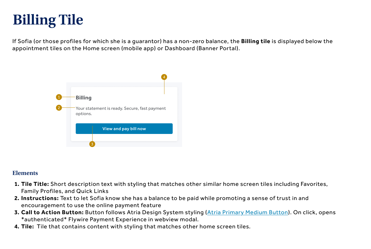
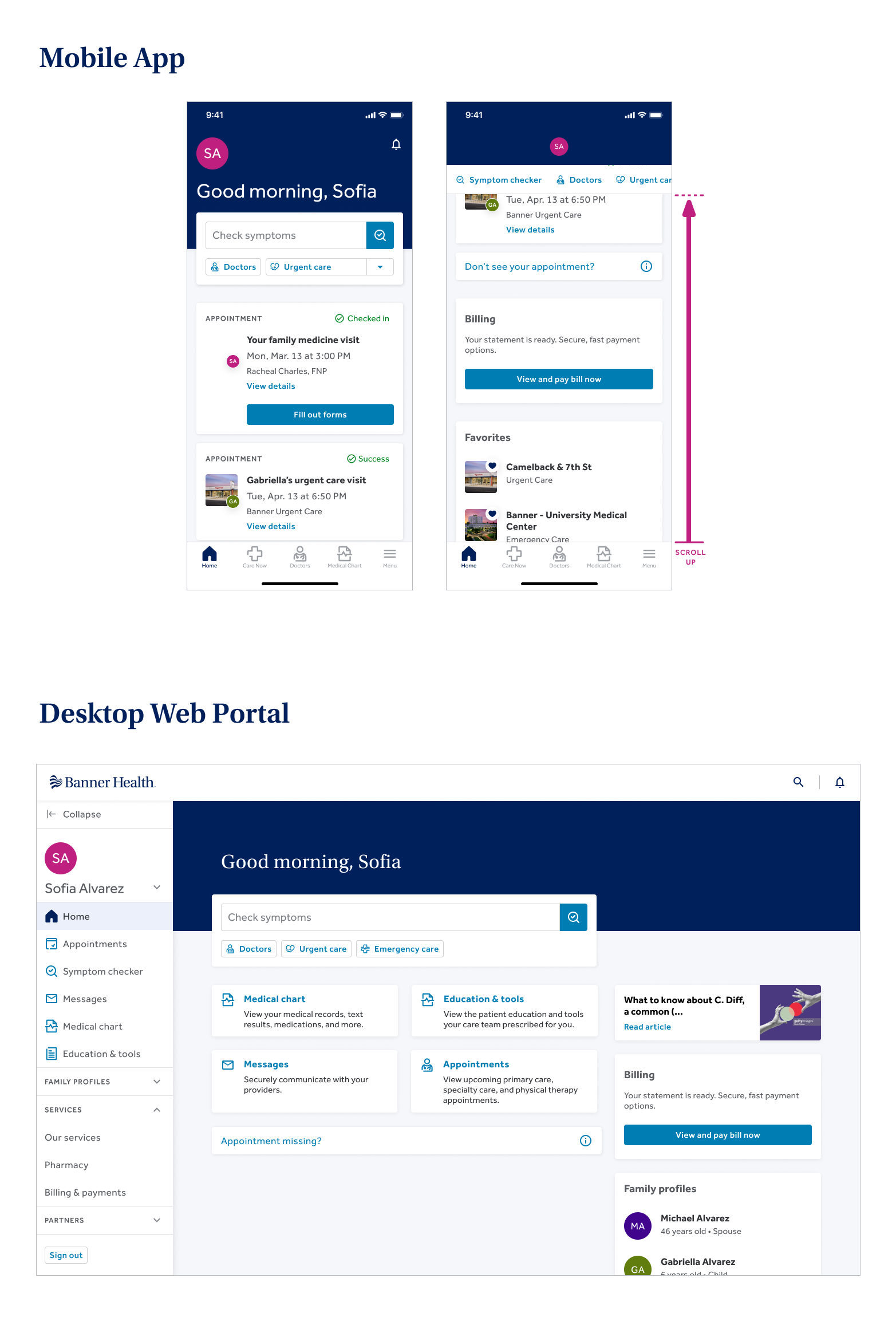
The design was intentionally minimal. A tile on the portal landing page, placed below upcoming appointments on mobile and alongside article content in the right column on desktop. It appeared only when a patient had a non-zero balance. The copy — "Your statement is ready. Secure, fast payment options." — was chosen to signal availability without implying we knew the balance, because we didn't. The language matched Flywire's tone closely enough that crossing systems didn't feel like a handoff.
I held one constraint firm: the tile would not appear with no bill to display. A broken empty state — showing up for patients with nothing to find — would have eroded trust at the exact moment we were trying to build it.
It launched silently in December 2025. No announcement, no marketing, no training. A tile appeared on the page.
Results
A silent launch that changed behavior — and sharpened the real question
From January through May 2026, patients found it.
Usage nearly quadrupled — from 5,361 attempts in January to 21,110 in May, with unique users growing from 3,142 to 9,917. Both new and returning users drove the growth, suggesting the tile was easy to discover and worth coming back to. For a feature with zero promotion and a limited eligible audience, this is better than typical for a silent launch.
Patients weren't avoiding payment. They were struggling to complete the journey successfully. Removing one barrier changed behavior at scale — and that distinction mattered for what came next.
The adoption curve validated the strategy. But it also sharpened the question. Getting patients into the payment system was clearly valuable. What happened once they were in — the confusion about what they owed, the uncertainty about insurance, the calls that generated new case IDs instead of answers — that was the real problem. And it required a different kind of work to understand.
Phase 2 — The Real Work
Research, blueprinting, and the harder question: what would it actually take to fix this?
Phase 2 began with a deliberate step back. Rather than extending the SSO integration with surface-level features, I returned to patients — this time with a research framework designed to map the full billing journey, not just the access point.
I conducted moderated interviews with recently-billed Banner patients using a jobs-to-be-done framework, tracing the experience from receiving the first bill through confirming the issue was resolved. I wasn't looking for feature requests. I was looking for the moments where patients lost the thread — and why.
Four jobs emerged that patients were consistently failing to complete:
- Understanding what they owed and why
- Confirming that insurance had been applied correctly
- Paying with confidence and knowing it was done
- Keeping records without building their own tracking system outside Banner's tools
The backstage research was equally revealing. Working with the revenue cycle team, I mapped the processes behind the patient experience — the call center systems, the data flows, the timing lags, the gaps in issue tracking. What emerged was a service design blueprint aligning the patient journey with frontstage and backstage processes, surfacing where continuity was breaking down and where the highest-impact interventions might be possible.
This blueprinting work shifted the conversation in a meaningful way. It moved the question from "what should the UI show?" to "what process changes and data connections would have to happen first?" That reframe is what makes design work durable — it grounds aspirational concepts in operational reality, so the team isn't designing toward something the infrastructure can't yet support.
I translated the research and blueprint into a high-fidelity aspirational prototype — not to commit the organization to building it, but to make the future state legible for stakeholders who needed to see it to believe it was possible. The concepts addressed all four patient jobs, including how an AI-enabled assistant might route patients to the right self-service workflow rather than simply answering questions in a void.
Where It Stands
In the work that happens before anything gets built
Phase 2 is in the discovery and define phase — and that work is often where the most consequential decisions get made. The artifacts produced so far represent a rigorous foundation for what comes next:
- Moderated patient interviews synthesized into jobs-to-be-done and outcome statements
- Customer journey map tracing the full billing experience from bill receipt through confirmed resolution
- Service design blueprint aligning patient-facing touchpoints with frontstage and backstage revenue cycle processes
- High-fidelity aspirational prototype addressing the four core patient jobs
The team is now working through prioritization: identifying which improvements can be made within current infrastructure constraints, which require upstream data work first, and in what order to pursue both. That prioritization is ongoing — and it's where the service blueprint earns its keep, making the trade-offs visible to the full cross-functional team rather than leaving them implicit in a slide deck.
This is a long-horizon initiative. The billing experience touches too many systems, too many stakeholders, and too many patient moments to fix in a single release. What the work so far has established is a shared, rigorous picture of the problem — concrete enough to guide decisions, honest enough to surface what's hard, and grounded enough to move from research into action.
Approach
Two phases, one strategy — a fast proof of concept, then the methodical work of understanding the system
Phase one moved quickly: a clear problem, a constrained solution, a silent launch, and data that validated the bet. Phase two slowed down deliberately — conducting rigorous research with real patients, mapping the backstage processes fragmenting their experience, and translating those insights into artifacts that give the full cross-functional team a shared, honest picture of what it would take to truly fix this.
The problem was well-understood before the project began — discovery here was about scoping a viable first step. Patients authenticated in the Banner portal had no path to billing without exiting, navigating to a separate public site, and re-authenticating with an account number most didn't have on hand.
- The only existing workaround — following a payment link from a paper bill — still required partial re-entry and left most patients without a clear route from the portal
- Key constraint shaping everything that followed: we couldn't surface the actual balance amount, only whether one existed
Artifacts:
Current State Access Flow
Maps the fragmented paths patients had to navigate to reach Flywire — from portal, mobile app, public site, and bill link — before the SSO integration.
The design challenge was deceptively simple on the surface: put a tile on the landing page. The real work was in the details.
- Placement — prominent enough for patients with an active balance to notice, but not so prominent it competed with appointments and urgent health information. I landed on a secondary position: below appointments on mobile, alongside article content on desktop.
- Content — the message had to establish trust, set accurate expectations, and prompt action — in one title and one line of body copy ("Your statement is ready. Secure, fast payment options.").
- Availability — the tile only appeared when a non-zero balance existed. We didn't have access to the actual balance amount, so showing the tile with nothing to display would have created a broken experience and an early trust loss.
Artifacts:
Anatomy of the Billing Tile
Annotated breakdown of the tile's four elements — title, instructional copy, call-to-action button, and overall tile container — each mapped to the design decision behind it.
SSO Tile — Portal & Mobile Designs
Final tile placement in context on desktop portal (right column) and mobile app (below appointments), with copy and CTA annotations.

Phase one made access easier. Phase two asked the harder question: even if patients can get in, what are they actually trying to do — and why is it still so hard? I conducted moderated interviews with recently-billed patients tracing the full billing journey using a jobs-to-be-done framework.
- I wasn't looking for feature requests — I was looking for the moments where patients lost the thread
- 8 distinct patient jobs emerged across the interviews, covering everything from confirming prior payment to managing refunds
- Outcome statements developed for each job — framed as Minimize [undesired outcome], per [unit] — giving the team measurable design targets specific enough to evaluate a decision against
Artifacts:
Patient Jobs to Be Done
8 jobs identified from moderated patient interviews — framed as: When [situation], I want to [motivation], so I can [outcome].
- Job 1: When I receive a medical bill, I want to immediately confirm whether I've already paid it, so I can avoid paying twice and wasting time disputing duplicate charges.
- Job 2: When a bill arrives, I want to match it to the specific visit, provider, and date of service, so I can confirm it's legitimate and understand what I'm being charged for.
- Job 3: After I get a bill, I want to confirm insurance has processed the claim correctly and the bill reflects my coverage, so I can pay the right amount.
- Job 4: When I need help resolving a billing issue, I want to reach the right person quickly and not have to repeat myself, so I can resolve the issue with minimal time and stress.
- Job 5: When I try to pay or manage bills online, I want simple, reliable access from a single place without needing a paper bill, so I can complete tasks quickly.
- Job 6: Before and at check-in, I want accurate, consistent cost estimates and copays that are correctly applied, so I can avoid surprises and rework.
- Job 7: When costs are high or cash flow is tight, I want flexible payment options with clear status tracking, so I can stay current without financial strain.
- Job 8: When I overpay or a charge is reversed, I want fast, transparent refunds with traceable reasons, so I can trust the system and reconcile my accounts.
Outcome Statements
For each job, I developed a set of outcome statements using the Jobs to Be Done format: Minimize [undesired outcome], per [unit]. These became the measurable design targets — specific enough to evaluate a design decision against. Below are two of the eight outcome statement sets.
Job 1 — Confirming prior payment
- Minimize the frequency of receiving duplicate bills, per billing period.
- Minimize the time to confirm prior payment, from bill receipt to verification.
- Minimize the wait time to reach billing support, per inquiry.
- Minimize the number of times a patient must provide proof of payment, per issue.
- Minimize the occurrence of being treated as a "fresh case," per follow-up.
- Minimize the uncertainty about payment status, at the point of decision to pay.
- Minimize the opportunity cost of time spent resolving billing issues, in hours or equivalent wages.
- Minimize the risk of collections for already-paid charges, per account.
Job 5 — Online access and payment
- Minimize the access barriers that require a paper bill or account number, per login attempt.
- Minimize the number of portals or systems needed, per episode.
- Minimize the complexity of portal navigation, per session.
- Minimize the frequency of payment system failures, per month.
- Minimize the number of steps to make a payment, per bill.

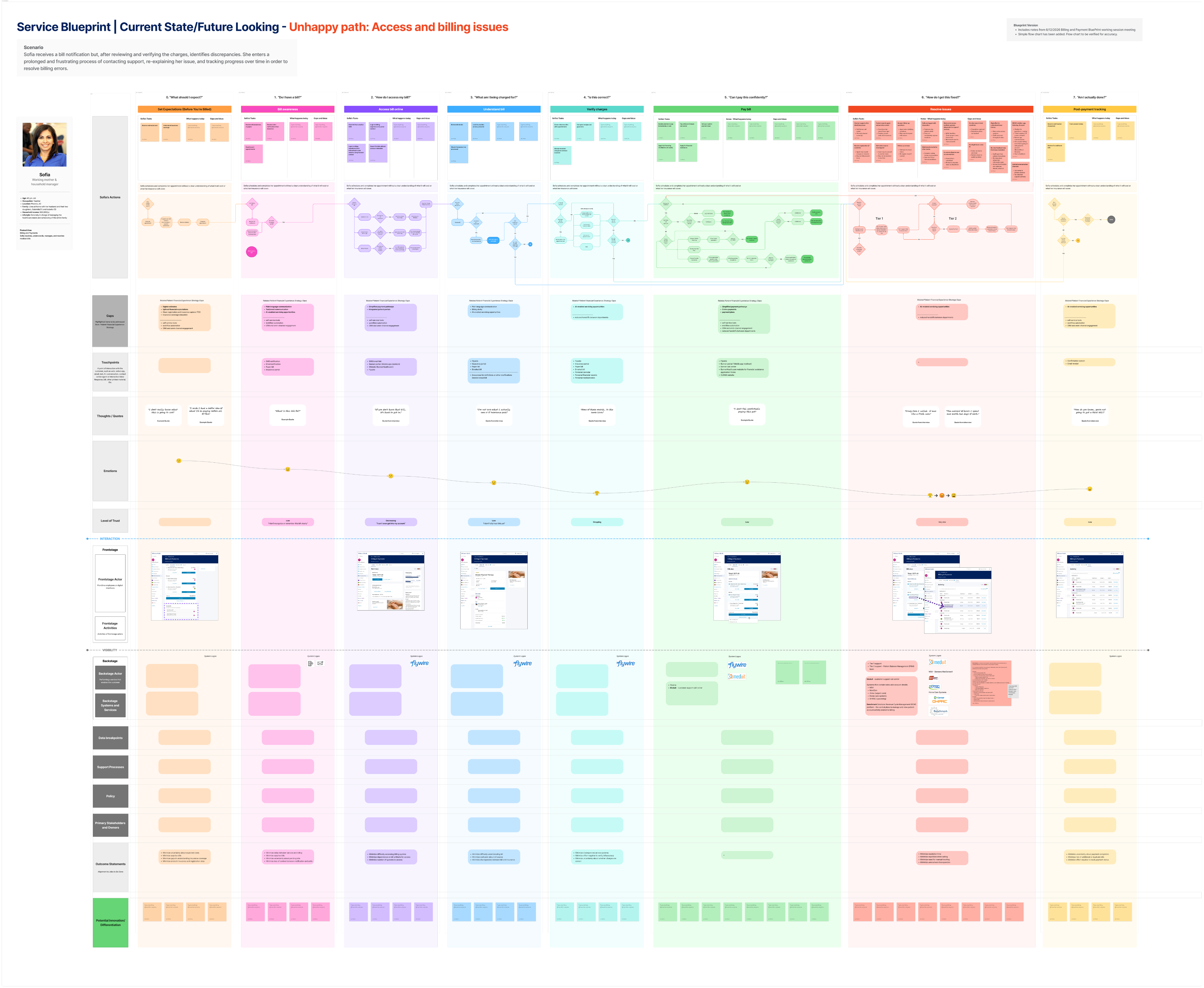
Patient interviews made the surface-level problem vivid. But the continuity breakdown patients described — new case IDs on every call, status updates that contradicted prior ones, issues that seemed resolved and then resurfaced — pointed to something systemic. I worked with the revenue cycle team to map the processes behind the patient experience.
- Call notes were captured as unstructured flat text across five separate systems, segmented by care type — urgent care, ambulatory, home services, and others
- No issue IDs existed. Why a patient called was sometimes captured; whether their issue was actually resolved was not
- Any agent picking up a prior case was working blind — which is exactly what patients were experiencing on the other end of the phone
- This backstage mapping was the key move — it shifted the conversation from "what should the UI show?" to "what process changes and data connections would have to happen first?"
Artifacts:
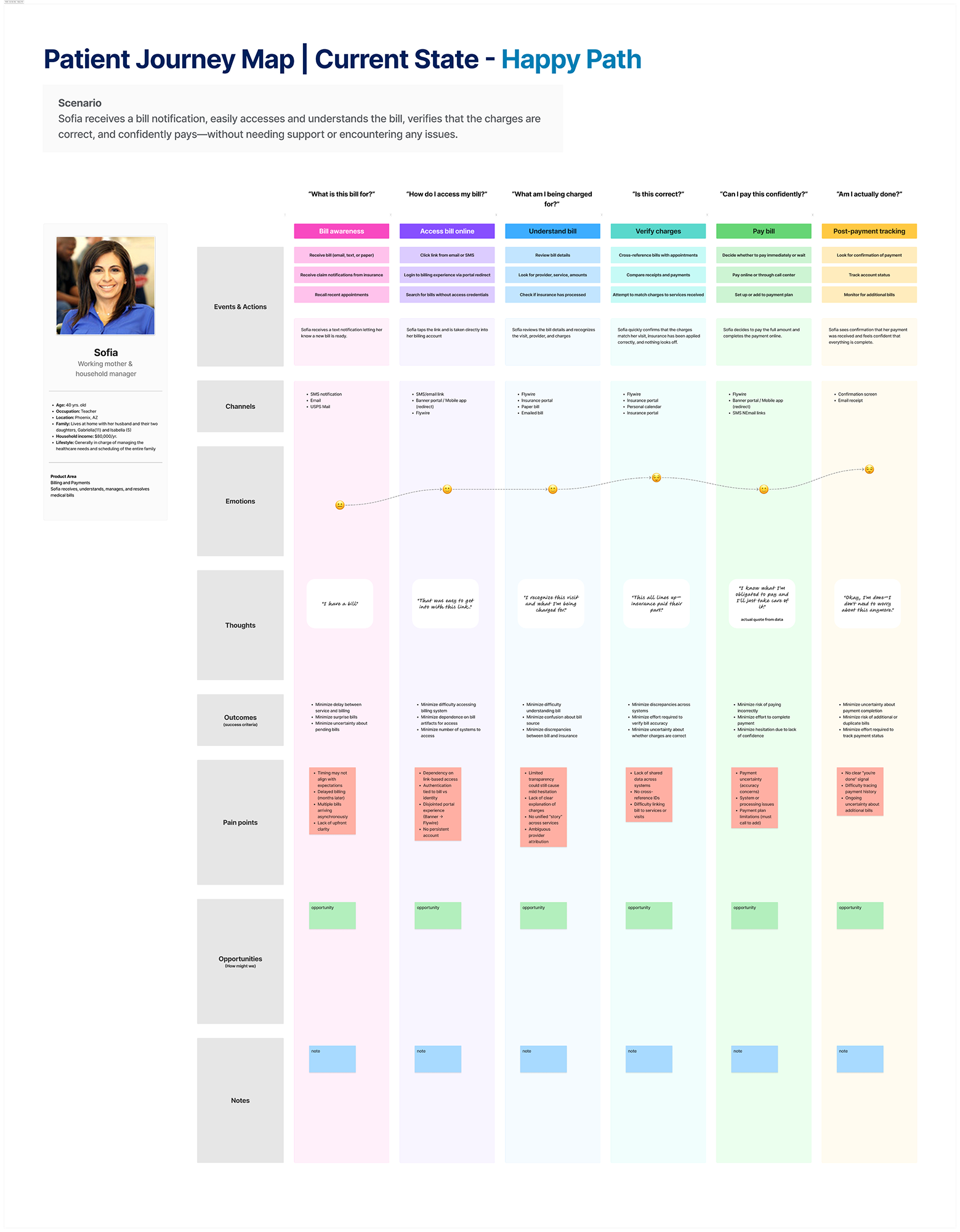
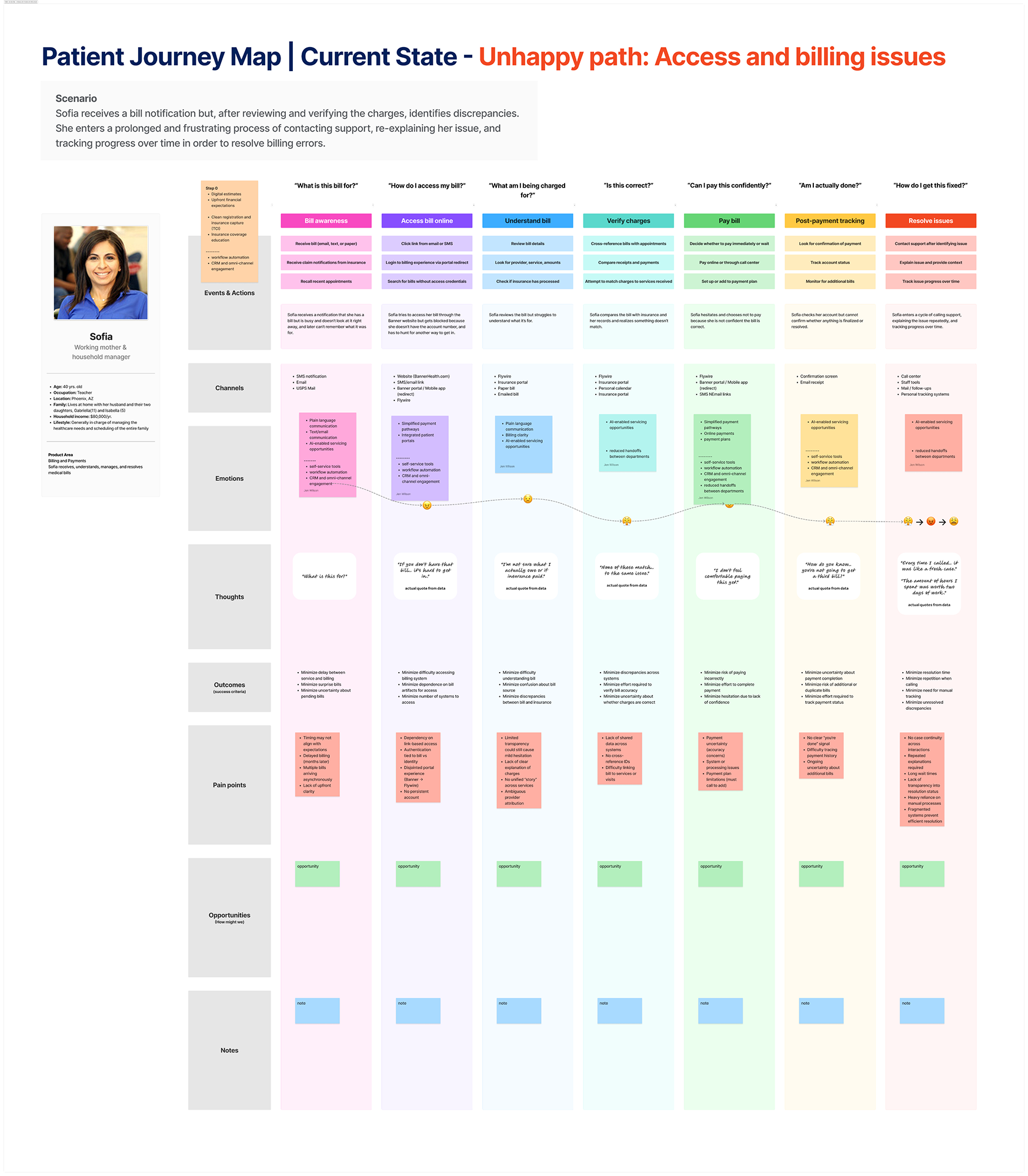
Patient Journey Map
Two flows: a happy path (notification-driven access, charges appear correct, smooth payment) and an unhappy path (access friction, billing discrepancies, repeated call center interactions with no continuity).
Service Design Blueprint
Aligns the patient journey with frontstage portal interactions, Flywire touchpoints, and the backstage rev cycle processes — surfacing where continuity breaks down and where quick wins are possible.
The patient interviews and jobs-to-be-done work made the gaps clear from a patient perspective. Aspirational concepts translated those findings into something tangible — giving stakeholders a concrete picture of what a better billing experience could look like before any infrastructure questions were answered.
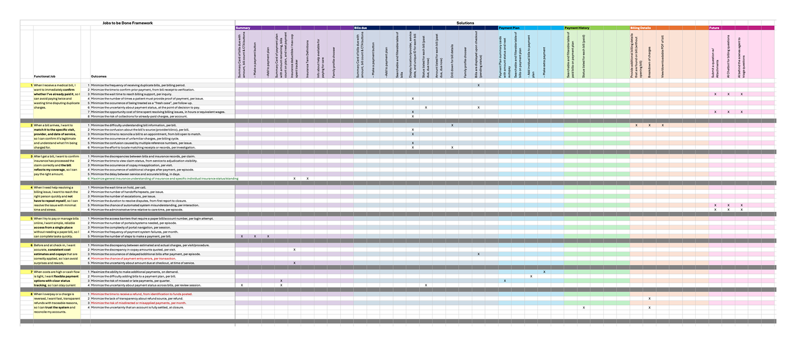
- Concepts addressed all 8 patient jobs identified in research, mapping proposed features to specific patient outcomes via a Jobs to Be Done × Solution matrix
- The designs helped build buy-in that a meaningfully better patient experience was possible, and surfaced the gaps that would need to be closed to get there
The service design blueprint (Phase 4) then provided the backstage view needed to ground that vision in operational reality. Together, both are now being used to identify quick wins that are immediately feasible — and that fit into a much larger, more connected future experience for patients across all facets of billing.
Artifacts:
Jobs to Be Done × Solution Matrix
Maps outcome statements for each of the 8 patient jobs to the specific features in the aspirational designs that address them — showing how design decisions trace back to validated patient needs.
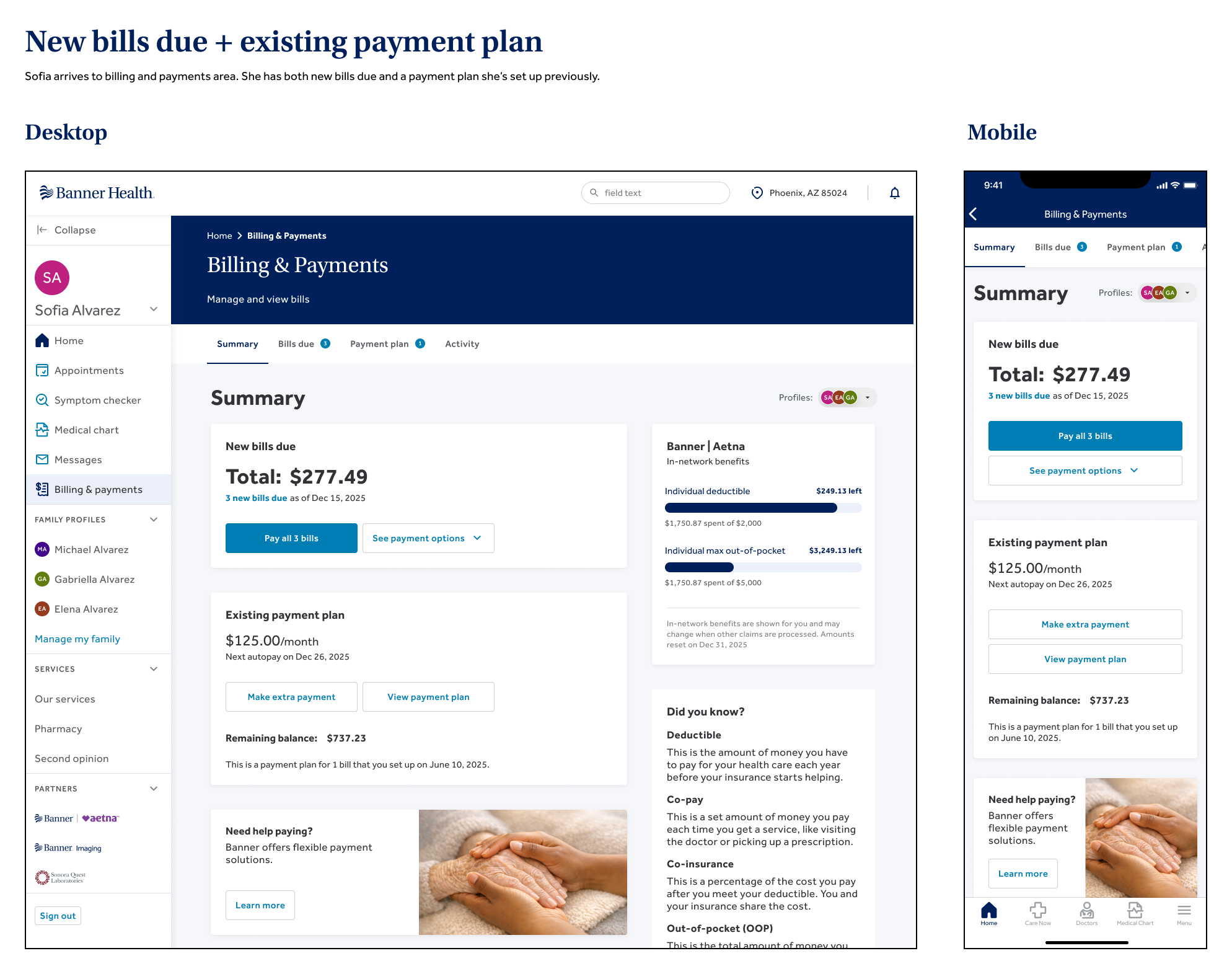
Aspirational Concept — Bill Summary
A centralized billing home in the patient portal — surfacing everything patients need to understand and manage their bills.
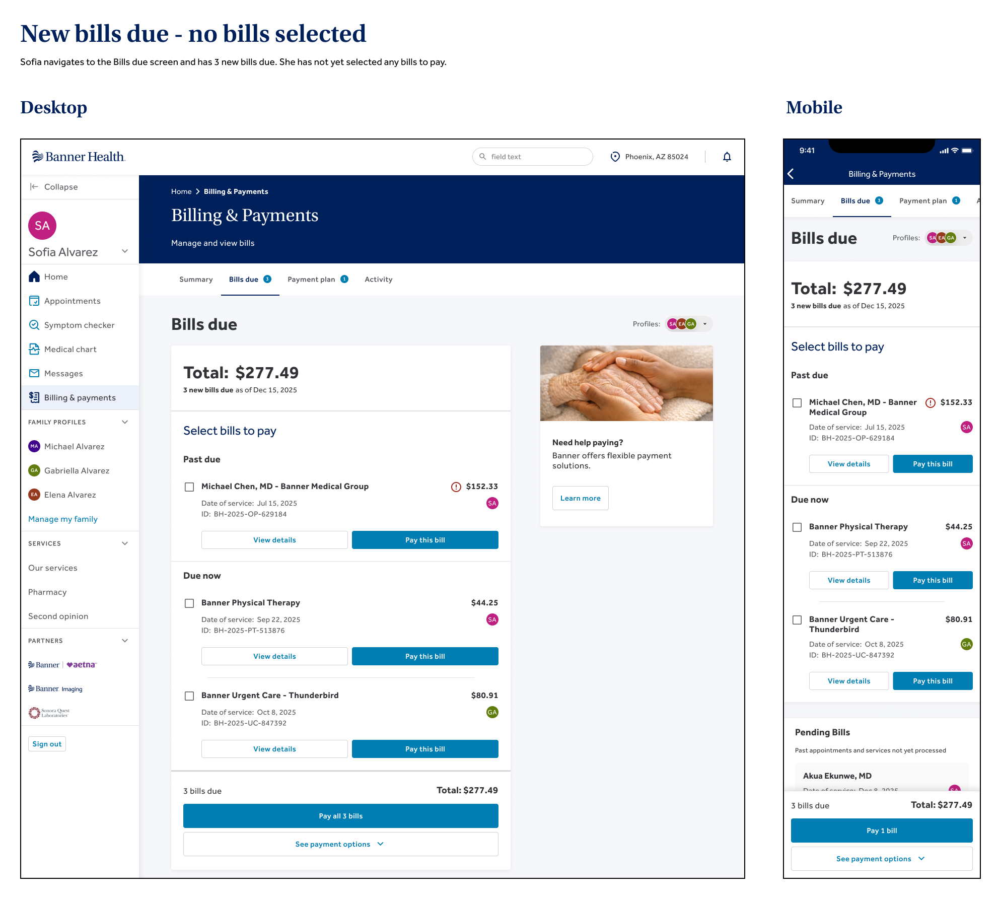
Aspirational Concept — Bills Due
View of outstanding bills — surfacing what's owed, when it's due, and enough context for a patient to act with confidence.
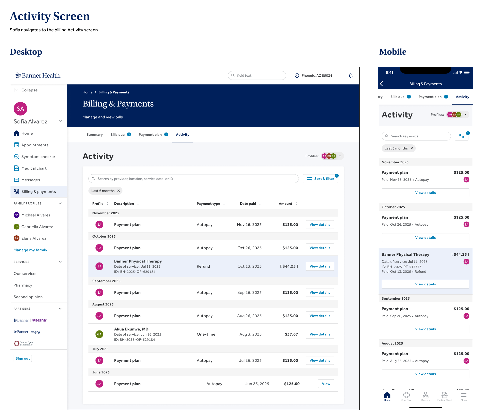
Aspirational Concept — Activity
Payment and refund history — showing what was paid, when, and any refunds issued, so patients can reconcile their accounts without calling.
Takeaways
Two speeds, one discipline
This project worked because it didn't ask for the same thing twice. Phase 1 needed speed: a scoped, defensible bet, shipped fast, validated by real usage data. Phase 2 needed patience: research, systems mapping, and a service blueprint substantial enough to align a cross-functional team around a problem nobody could solve alone.
Knowing which speed a problem calls for — and being equally comfortable in both — is the throughline of how I approach ambiguous, complex work:
- Strategic sequencing — choosing the foothold problem first, not because it was easiest, but because it earned the room for the harder work to happen.
- Service design fluency — mapping frontstage and backstage together, so design decisions are grounded in operational reality, not just what's visible on screen.
- Comfort with ambiguity — presenting rigorous, in-progress work with the same confidence as a finished feature, because at this level, the upstream work is the deliverable.
None of it matters if it doesn't reach the patient on the other end of a confusing bill — still recovering, still trying to make sense of what they owe. That's who this work is for.