Overview
Two companies, two teams, one unified workflow
It was an exciting time when our company acquired another eDiscovery company. Overnight, we gained new team members, new products, and new services. But naturally, there was overlap, and consolidation was necessary.
One example was the unification of the Technology Assisted Review (TAR) solutions both companies had. TAR solutions are complex — systems that comb through millions of documents and are trained to categorize them with varying levels of confidence. Running and calibrating the system to achieve desired results requires expertise.
Each company had its own team of skilled individuals with unique workflows, tools, and approaches.
TAR Augmentation Method
Predictive AI
Tool(s) Used
Several 3rd party off-the-shelf tools
TAR Augmentation Method
Linguistic Modelling
Tool(s) Used
Custom-built software called Matter Analytics (MA) Active Learning
Team Orange and Team Blue each faced challenges with their tools and workflows, leading to inefficiencies and ultimately hindering the effectiveness of the technology. This resulted in:
- Wasted time navigating between multiple tools
- Difficulty in accessing and understanding key information for training models
- Lack of data consolidation for informed decision-making
Key Problems
How can we provide TAR model configuration and management flexibility while saving Analytics Consultants time?
How can we better support informed decision-making to validate TAR models?
Results
Unifying two teams — and delivering unprecedented results
The redesign of the Active Learning feature unified the workflows of the Orange and Blue Teams, resulting in:
- Increased efficiency through a single, intuitive interface
- Improved data consolidation and access to key information
- Enhanced TAR model performance through a combined approach (predictive AI and linguistic modeling)
- Reduced costs for clients due to faster, more accurate document review
The success of the redesign is illustrated in one of the first cases where it was used — a federal criminal investigation into a global transportation company for possible infractions of the Foreign Corrupt Practices Act (FCPA) in India. The company's legal counsel needed to quickly produce responsive documents and find key documents to prepare their defense.
Key Results
- Redesigned MA Active Learning software allowed Analytics Consultants to use the new unified workflow and TAR model augmented with both AI and linguistic modeling
- 4M total documents reduced to 250K through 2 rounds of responsive review, with precision rate and recall of 85% or higher — a reduction of almost 94%
- 810 key documents quickly delivered to outside counsel, saving hours of review and gaining more time for case strategy
- Work complete in just 3 weeks, enabling outside counsel to provide the best defense to the underlying company

Problem to Solve
Scattered tools, complex workflows, and frustrated users
In addition to unifying two teams' workflows, there were additional problems Analytics Consultants on both teams were encountering:
- Switch between multiple tools: Orange Team navigated between many separate tools to run their TAR model augmented with predictive AI. This constant toggling wasted valuable time.
- Hunt for scattered information: Key data and functionalities were dispersed across different interfaces in MA, making it difficult for Blue Team to find what they needed quickly.
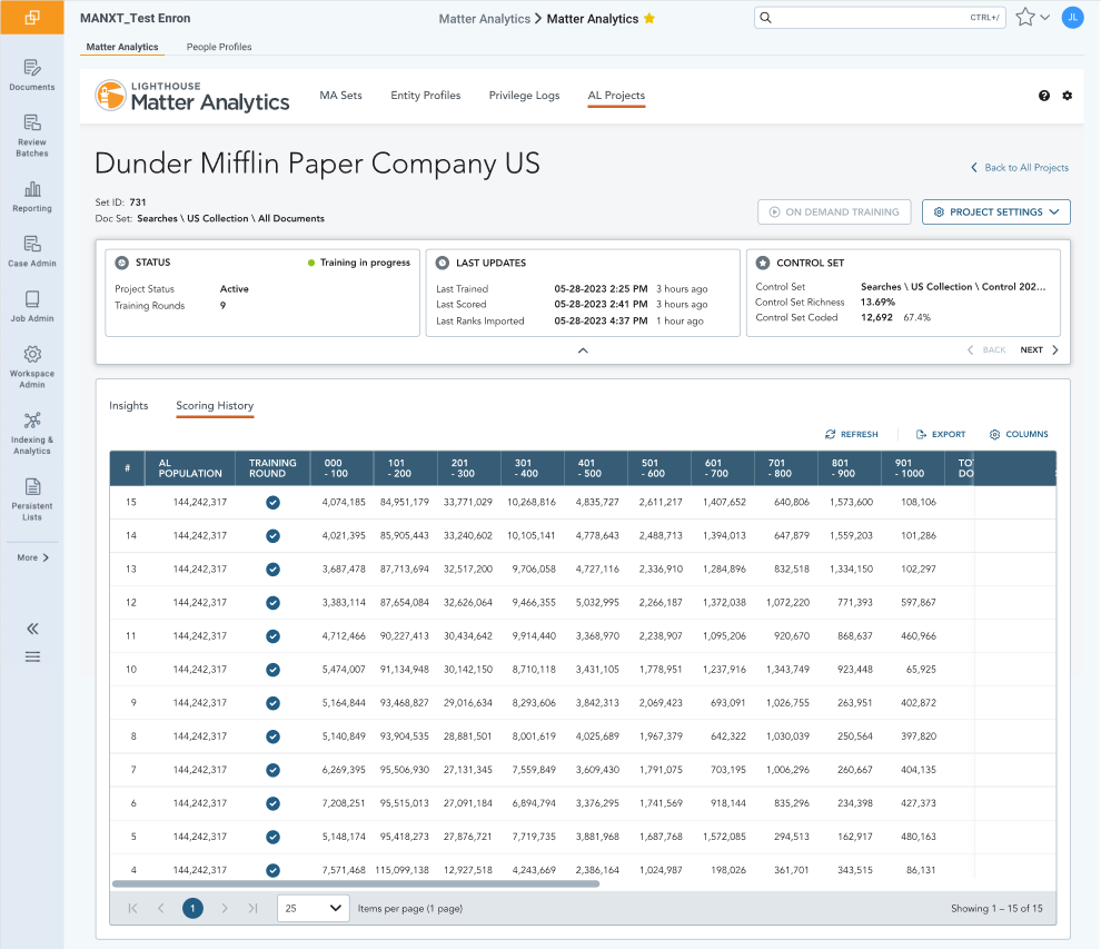
- Decipher complex visualizations: Understanding the data presented in visualizations required significant effort, slowing down the decision-making process for both teams.
These problems made tasks time-consuming and frustrating. I wanted to create a way for all Analytics Consultants to configure, train, and manage models more efficiently and intuitively.
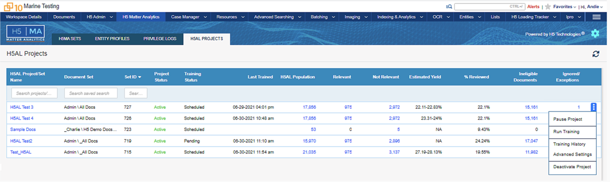
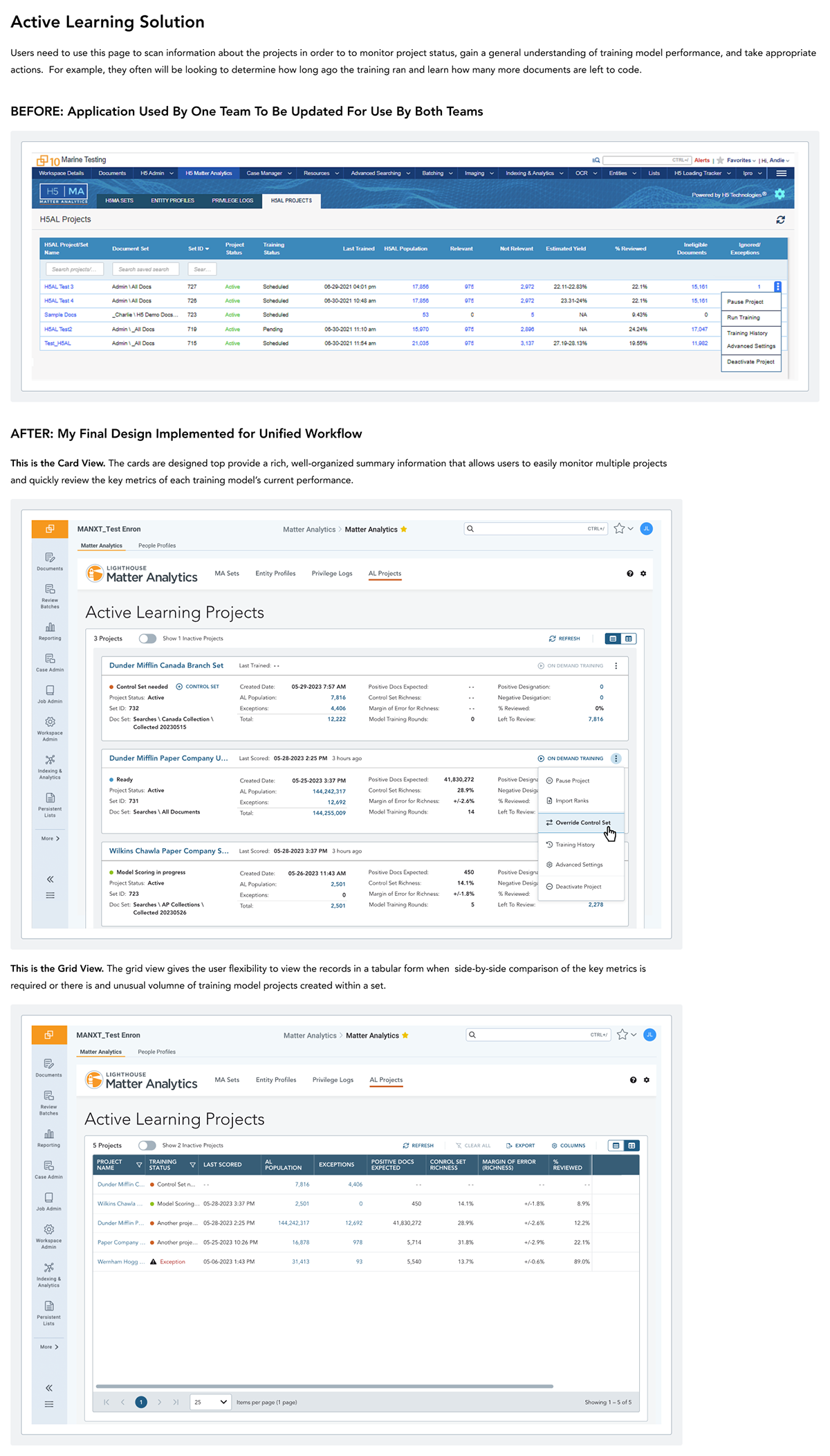
Original design of the Matter Analytics application used by one of the two teams. This application was to be redesigned to unify the Active Learning task workflow.
Approach
Design thinking — six phases
To ensure the resulting design of this complex feature met all necessary business requirements and was easy for members of either team to use, understand, and be effective in the new unified process, I followed proven UX design practices. My process followed the traditional design-thinking approach with five non-linear, iterative phases — plus a sixth Handoff phase.
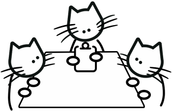
Through interviews, shadowing, and document reviews, I developed a deep understanding of the workflows, tools, and pain points of both Orange and Blue Teams.
Using a variety of information gathering methods in this discovery phase of the process, I identified that the key pain points experienced by the Analytics Consultants were frustrations from:
- using multiple tools,
- scattered information, and
- complex visualizations.
Artifact:
Affinity Mapping Insights
- Detailed Metrics: Users needed detailed metrics, such as the margin of error, readily accessible.
- Flexibility: The system needed to accommodate non-standard workflows such as when there are changes in case scope and a model reset is required.
- Training and Control Set Management: Users required control over and clear information about the creation and designation of training and control sets.
- Intuitive Interface: Users emphasized the need for a clean, intuitive interface with well-organized information.
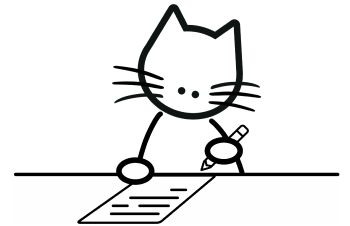
I used information that I had learned in the previous step to identify the core problem to be solved. The core problem was the lack of a unified workflow, centralized data access, and ineffective data presentation for decision making which hindered the efficiency and effectiveness of the Analytics Consultants.
During this phase of the process, I created User Personas, defined UX Requirements, Success Criteria, and developed happy path and edge case Use Cases.
Artifacts:
Sample of UX Requirements
- Unified Interface: The application should offer a unified interface that seamlessly integrates workflows from both teams, ensuring a smooth transition for users.
- Progress Tracking: The application should provide comprehensive progress tracking features, allowing users to monitor the status of their Active Learning review and identify areas for optimization.
- Real-Time Feedback: Users should receive real-time feedback on the effectiveness of their coding decisions, helping them understand the impact of their actions on the Active Learning model.
- Accessible Reporting Tools: Users should have access to reporting tools that enable them to generate and share reports on the outcomes of the Active Learning review, facilitating collaboration and decision-making.
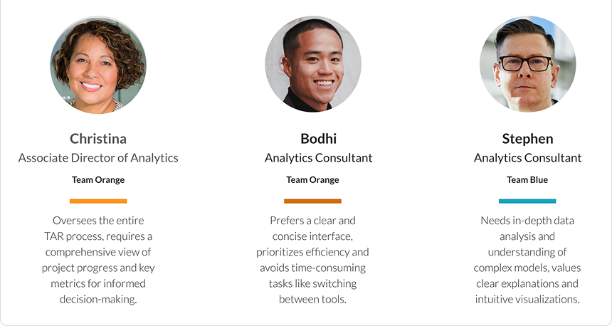
User Personas
Detailed personas created for each of the three roles involved in TAR workflows.
Considering the need for flexibility and scalability, I explored different design solutions to accommodate the complex requirements and use cases, including data consolidation and multiple view options.
I paid particular attention to statistical data presentation to provide users a way to quickly monitor and make decisions about the training sets in a project. During the design exploration, I sought out feedback early and often.
Artifacts:
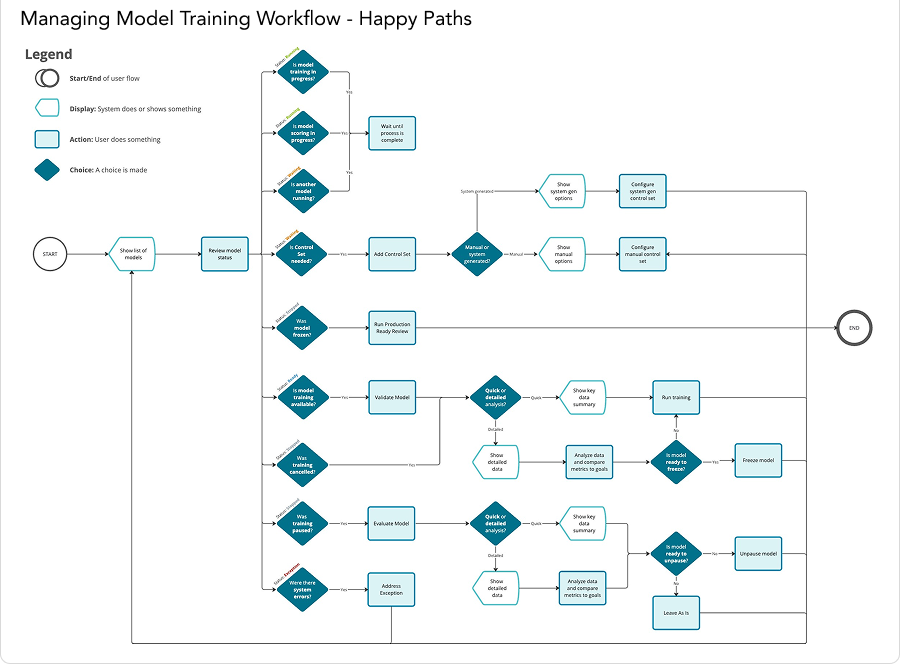
UX User Flow
Mapped to verify my understanding of the process with stakeholders and used to create Use Cases.
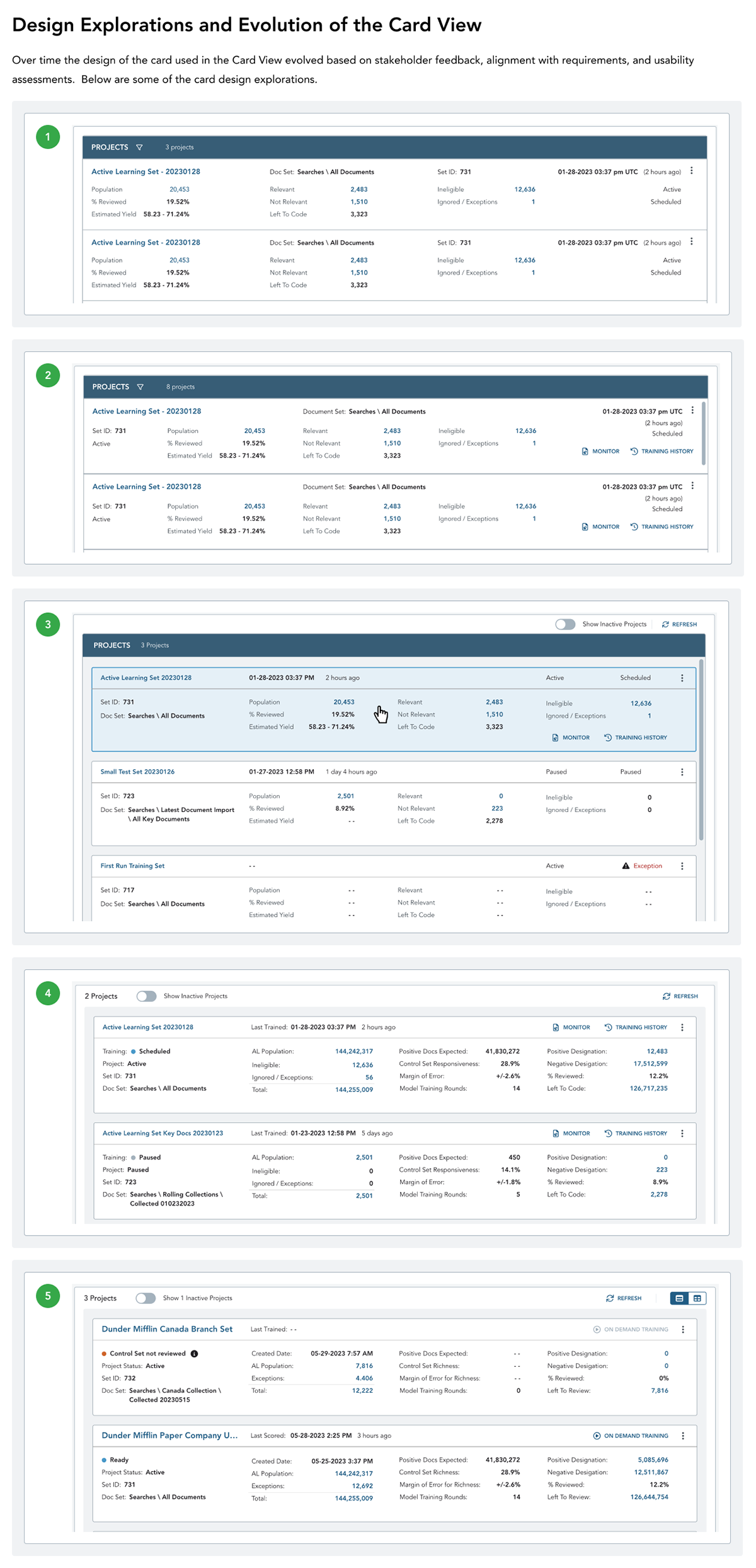
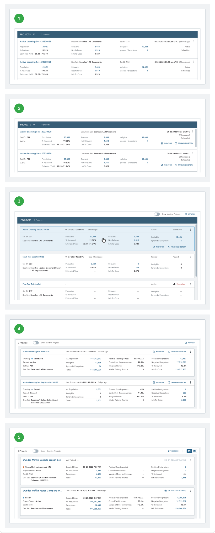
Design Explorations and Evolution of the Card View
Designs from various stages illustrating how the Card view evolved.
From the ideation phase, I created prototypes of the most promising design variations. In particular, I developed prototypes with a choice between Card View and Grid View.
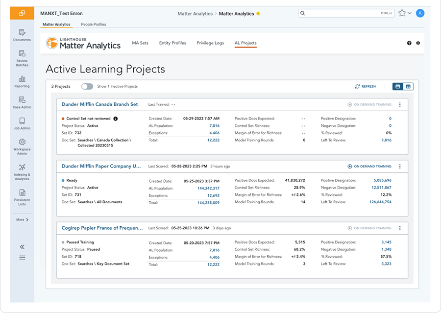
- Card View offered quick summaries for smaller projects, while
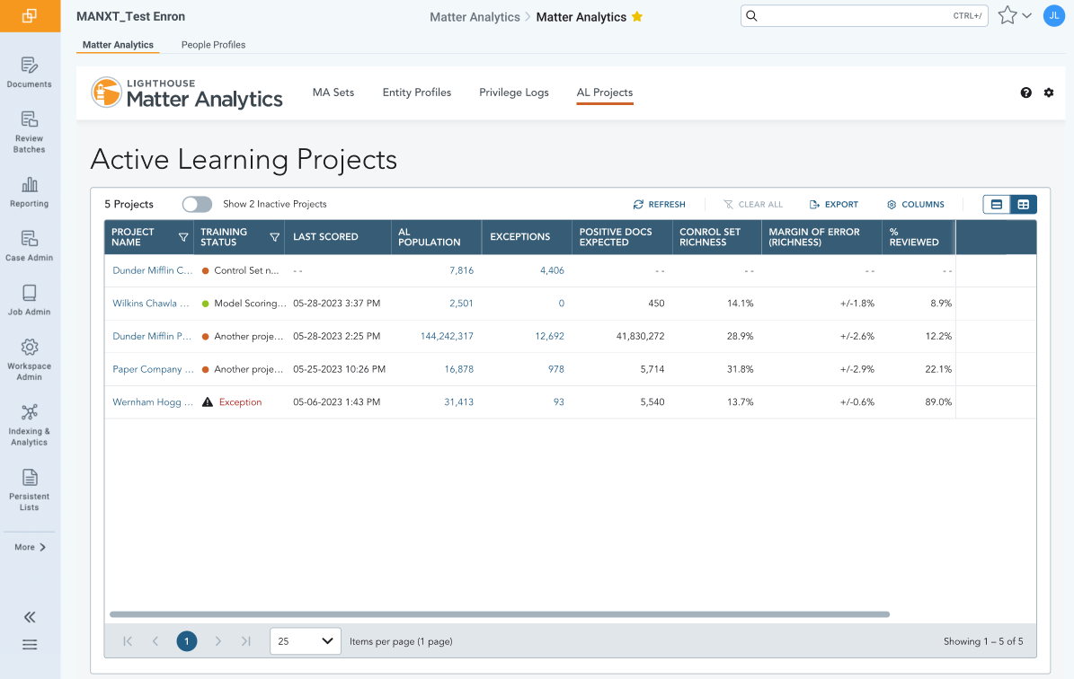
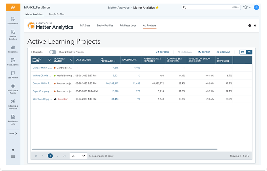
- Grid View provided a detailed tabular format for side-by-side comparisons and larger datasets.
As the higher fidelity designs were created these prototypes were shared in regular design critique sessions with UX/UI designers and developers and feedback was gathered from cross-functional stakeholders, helping to refine the designs based on usability, adaptability, alignment with our Design System, and adherence to design principles.
Artifacts:
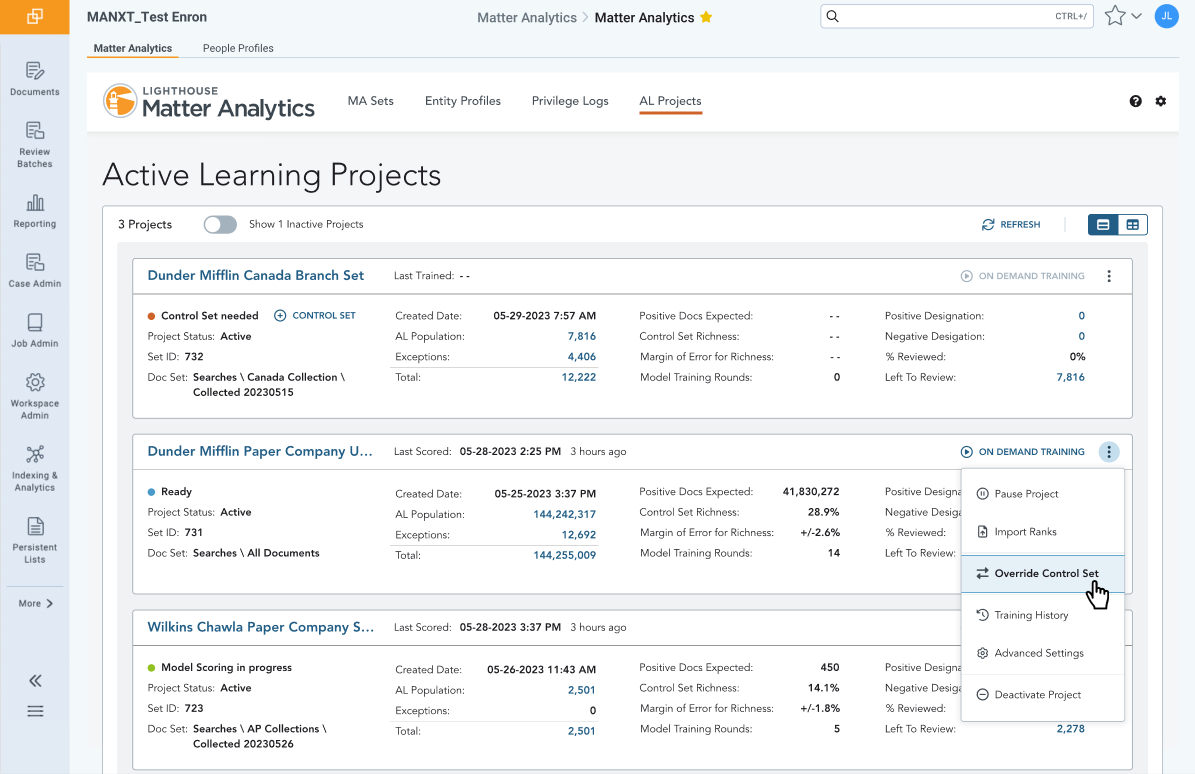
Card View
Prototype design of the Card view.
Grid View
Prototype design of the Grid view.
I gathered feedback from both teams and stakeholders throughout the design process, refining the prototype based on alignment with UX requirements, suitability for users and use cases, design usability, scalability, and alignment with design principles.
Artifact:
Sample of Compiled Stakeholder Feedback
- Users need immediate access to additional data to understand the current state of the model, we need to add these data points to the top level view.
- Some stakeholders feel that the Control Set definition process is too complex, we need to simplify it without sacrificing functionality.
- Users need to understand the current status of their Active Learning more quickly, we need to make status tracking more prominent.
- Users are requesting the ability to customize the view so that their preferences are maintained each time they return to better suit their workflow preferences.
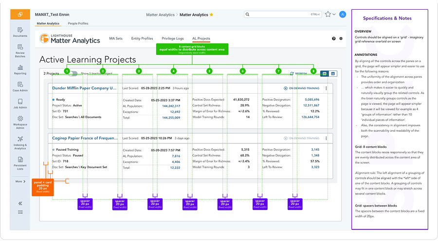
After I had completed the finalized designs in the user interaction and visual design phases, I documented detailed design specifications for the developers. I outlined both the intended behavior and visual specifications to enable a smooth transition from design to development.
As the design was implemented, I conducted software quality assurance testing as part of the development sprints to verify compliance with UX requirements. I provided detailed feedback specification guidance to software developers in the form of bugs that could be prioritized by the Product Owner.
Artifacts:
Detailed Specifications
Responsive grid specifications provided to developers for the Card view.
UX QA/Validation Bug Categories
- Visual Inconsistency - issues related to inconsistent or incorrect visual styling across elements, including text, buttons, and dropdown lists. specified family, size, weight, color, or spacing
- Interactive Behavior - Problems with the behavior or functionality of interactive elements such as buttons and dropdown lists.
- Alignment and Layout - Inconsistent or excessive whitespace and padding between elements, affecting visual balance and readability.
- Content and Copywriting - Issues with content and copywriting, including grammatical errors, unclear instructions or labels, or ambiguous language that may confuse users.
- Mobile Responsiveness - Elements do not adjust properly on different screen sizes, leading to layout issues or content overflow on mobile devices.
- Accessibility - Issues with accessibility, such as insufficient color contrast for users with visual impairments, missing alt text for images, or inaccessible form inputs.
Solution
A unified interface with the flexibility both teams needed
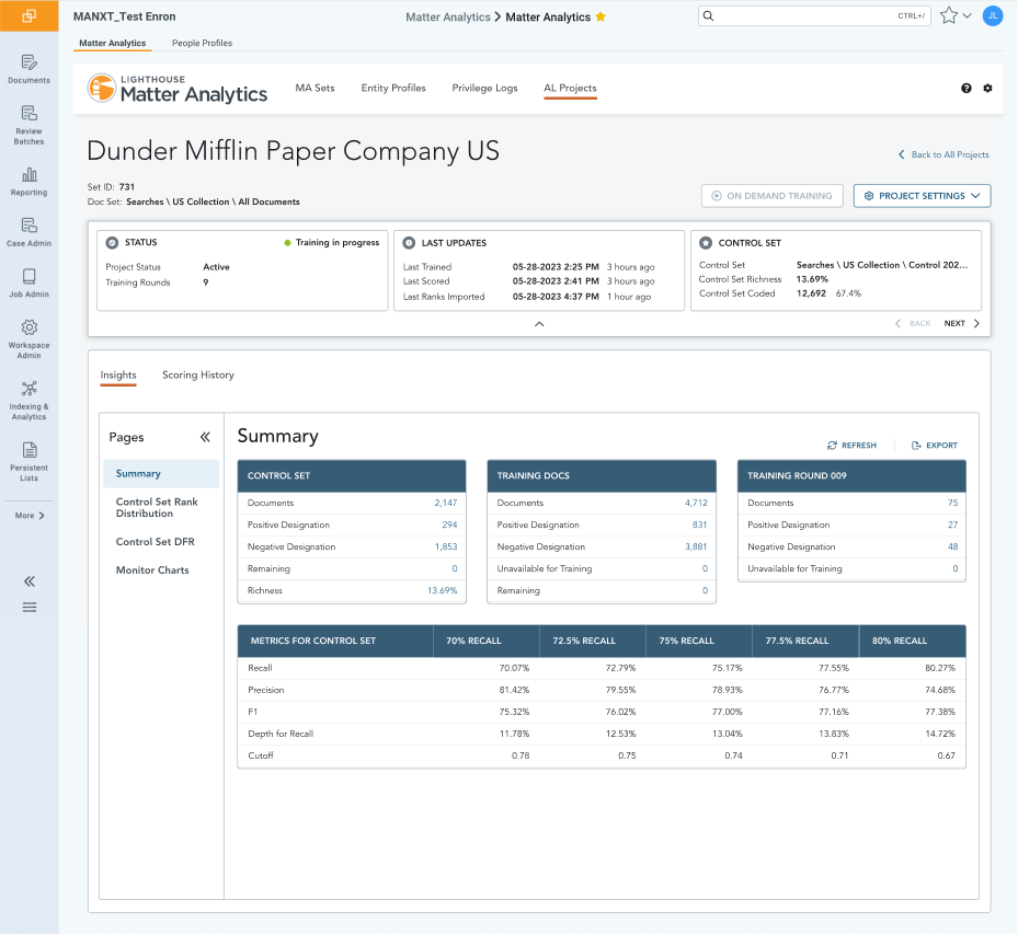
My goal was to create a design that not only unified the two workflows but also addressed the pain points each team experienced. One significant pain point was the lack of data consolidation and the ability to quickly access key actions. In one team, the data and tools were scattered across several systems; in the other, they were spread across pages in a way that didn't align with their workflow or needs.
Given the merger of two teams with distinct working styles, providing flexibility was crucial. Additionally, the design needed to scale seamlessly as new capabilities were added.
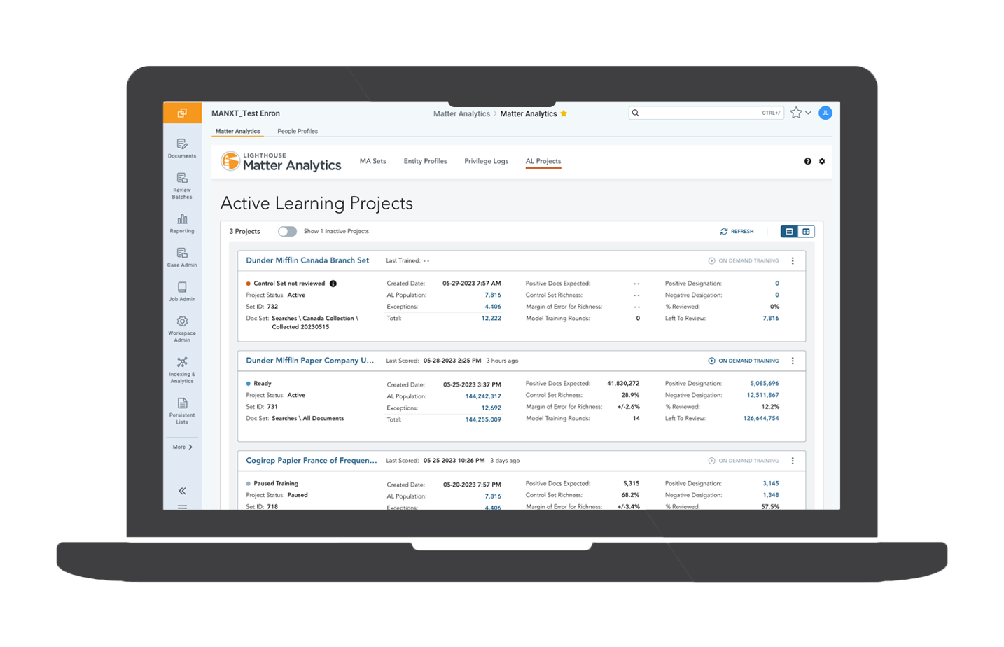
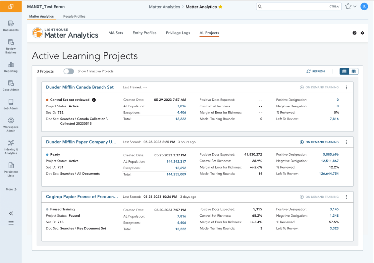
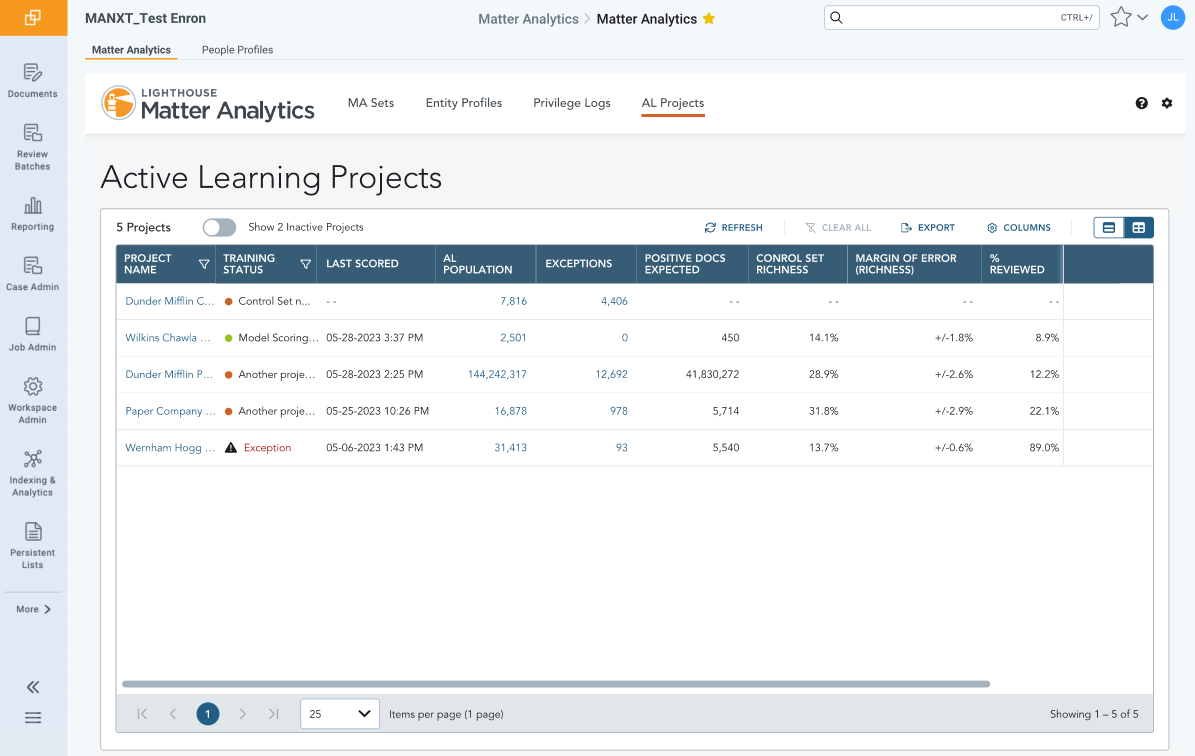
One primary improvement was introducing a choice between two views: Card View and Grid View.
Card View
The cards are designed to provide rich, well-organized summary information that allows users to easily monitor multiple projects and quickly review the key metrics of each training model's current performance. This works well when there are only a few projects within a set — typically 1–2 project models.
Grid View
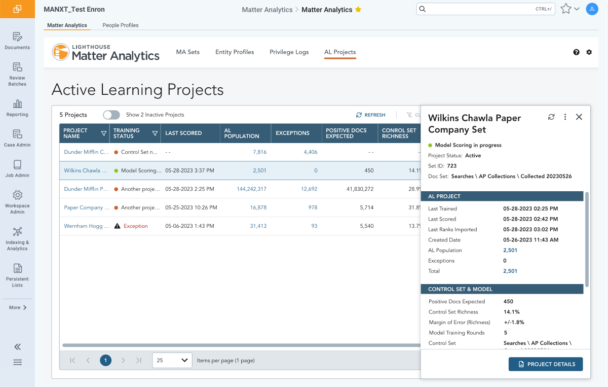
The Grid View gives users the flexibility to view records in tabular form when side-by-side comparison of key metrics is required or when there is an unusually large volume of training model projects. The Grid View provides a detail panel for each record that slides out when the user needs more detail without leaving the page.
Takeaways
Designing for competing expertise
The central tension in this project wasn't technical — it was human. Two teams had developed deep, opposing mental models of the same task. Any design that felt natural to one would feel wrong to the other. Getting both teams to trust a single interface meant understanding not just what they did differently, but why each approach made sense to them.
- Cross-stakeholder research — when user groups have competing expertise and workflows, surface-level observation isn't enough. Shadowing both teams independently before synthesizing revealed distinctions that a combined session would have flattened.
- Flexibility as a design principle — offering Card View and Grid View wasn't a hedge; it was the right call. When users have fundamentally different data-processing styles, one layout is a compromise. Two layouts, done well, is a feature.
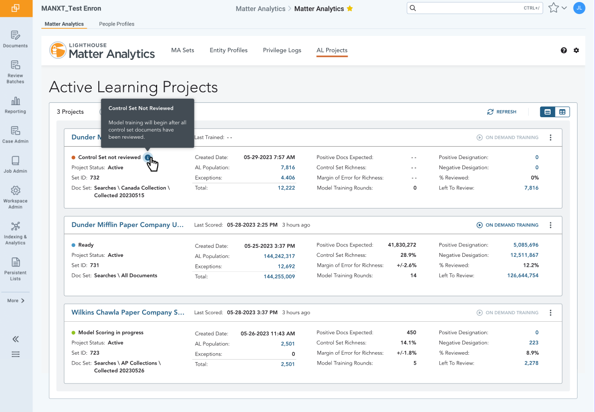
- In-context communication — building explanations directly into the interface reduced the teams' dependence on training and documentation, and made the design more resilient as capabilities scaled. Clear UI copy is a design deliverable, not an afterthought.
The answer to whether a unified interface could earn the trust of two competing teams turned out to be yes — but only because the design took both teams seriously from the start.
Gallery
Active Learning Feature Design Work